Разработка ПО
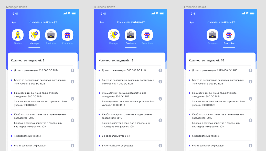
 Менеджмент
 Для компаний
 Для стартапов
 Архитектура ПО
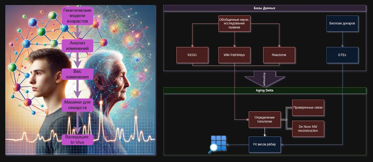
Applications with artificial intelligence are a trend, and we often apply various methods of automation with AI. This project combines several AI services, both for improving old photographs and for writing biography text. It also integrates Wasabi cloud storage, the Stripe payment system, text generation with ChatGPT, a QR code generator and scanner, and much more. The system and mobile application are written using modern technologies: Angular, Python, MySQL, Docker.
Оглавление
- Vorfahr — a SaaS platform for QR memorials, AI content, and an internal production loop
- Video review of one of the later versions
- Client feedback on the collaboration
- Another review of the stable version
- What exactly was done
- What the public part of the service looked like
- Question base, dialogue with the user, and service pages
- User question base
- Panel where you can ask your own question
- Company page
- QR center, support, and account
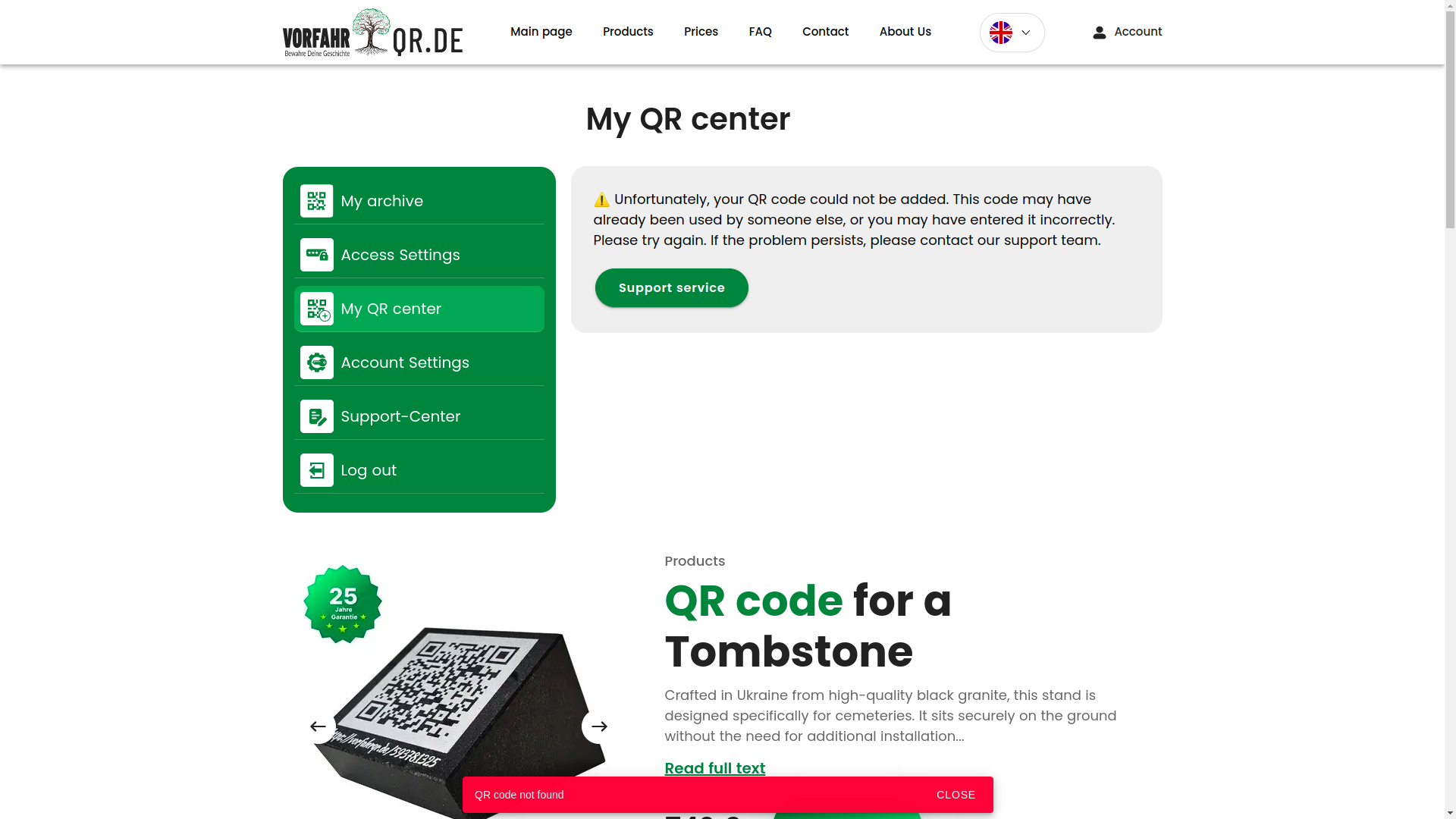
- QR center with scanning
- QR center with selection of a linked product
- Support center
- Account settings
- Login via social networks and by username
- Registration with validation
- Positive notifications
- Administrative area and internal contour
- Archive, QR profiles, and page builder
- Page archive
- Selection of QR codes and linked profiles
- Downloading QR in different formats
- WYSIWYG page builder
- Uploading photos
- Photo slider
- AI photo enhancement
- Other data input methods
- Biography generation via LLM
- Page generation result
- Family archive and available space
- Configuring access to the page
- Password recovery
- Designer notifications
- Protected QR code generation
- What difficulties we faced
- 1. Python, Django, and not the simplest server stack
- 2. Frequent design changes and cascading impact on logic
- 3. A large number of external integrations
- 4. Lack of an ultra-detailed technical specification at the start
- Technologies used
- Project results and value for the client
- Why controlled timeline stretching was a plus here
- Need a similar project?
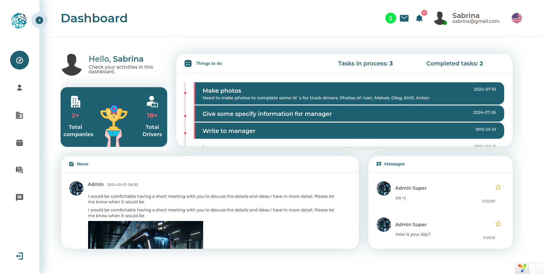
Vorfahr — a SaaS platform for QR memorials, AI content, and an internal production loop
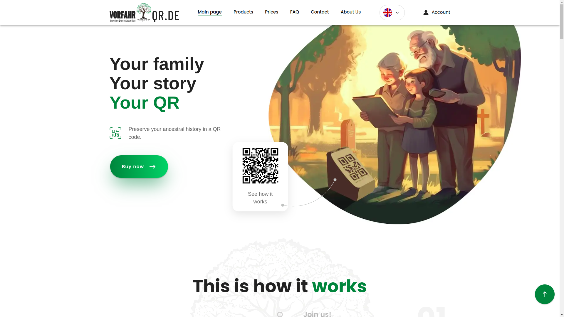
This was exactly the type of project where behind a beautiful interface there is not just one website, but an entire small digital ecosystem =). On the surface, the user sees a clear service with QR codes, memory pages, an archive, payment, and neat navigation. But under the hood, there is a much more serious story: a server side, an administrative area, employee roles, production accounting, integrations with external services, and AI modules that actually work, rather than simply decorating the presentation.
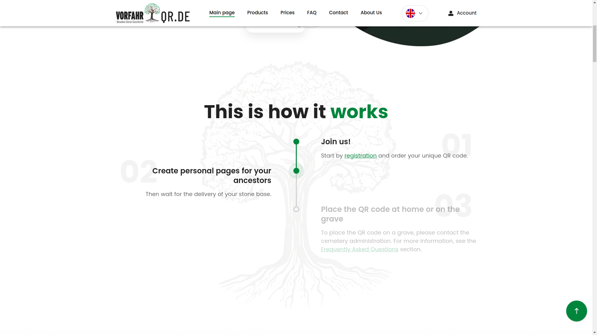
The project was launched for the German market and later received additional stages for deployment and localization for Ukraine. In total, we covered three major areas: development of the server side, a user application for desktop and mobile devices, and an internal accounting system for production, digitization, and slab movement. The work was divided into 14 stages, and each of them was accepted separately. This was important for the client: transparency, manageability, and the ability to calmly check the result without jumping into the unknown.
I will separately note a pleasant point: despite the full scope, many integrations, and the inevitable chaos of non-template development, the client was satisfied at the start, throughout the process, and at the final delivery. And that, honestly, is valued no less than the code itself in complex digital products.
Video review of one of the later versions
Below is a review of stage No. 12. This is not the final build, but the frontend, user scenarios, and overall product logic are already clearly visible.
Client feedback on the collaboration
When a project is complex, feedback is especially important: it shows not only the emotion, but also that the process was handled professionally. Below is one of the client's reviews for this collaboration.

Another review of the stable version
And here is stage No. 10. The version is not the newest, but it is already stable and representative in terms of business logic. It clearly shows how the project looked before the series of later visual and UX refinements.
A final video review was also planned later, but even now you can view the live production version of the product via the link above and assess how carefully this system was assembled.
What exactly was done
Very briefly, we built not just a landing page and not just an application, but a multi-layered SaaS product. Moreover, the product is rare in its subject matter and therefore especially demanding in terms of UX, user trust, and delicacy of presentation.
- Public part of the service — landing page, first-touch scenarios, informational pages, and the user's path to registration.
- User account — creation and editing of memorial pages, archive, photo uploads, biography generation, and work with QR codes.
- AI modules — photo enhancement and text generation using an LLM (large language model, that is, AI that can understand a request and write text).
- Payment logic — Stripe integration for payment.
- External logins — OAuth (secure login through third-party accounts) for Google and Facebook.
- Data storage — moving media and pages into the Wasabi cloud infrastructure.
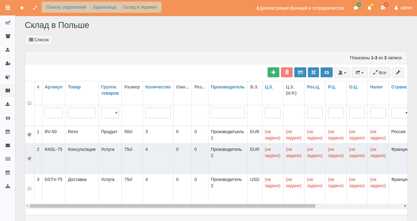
- Administrative area — management of users, tokens, statuses, roles, tables, production, warehouse, and balances.
- Production loop — separate logic for accounting, digital linking, and QR code issuance.
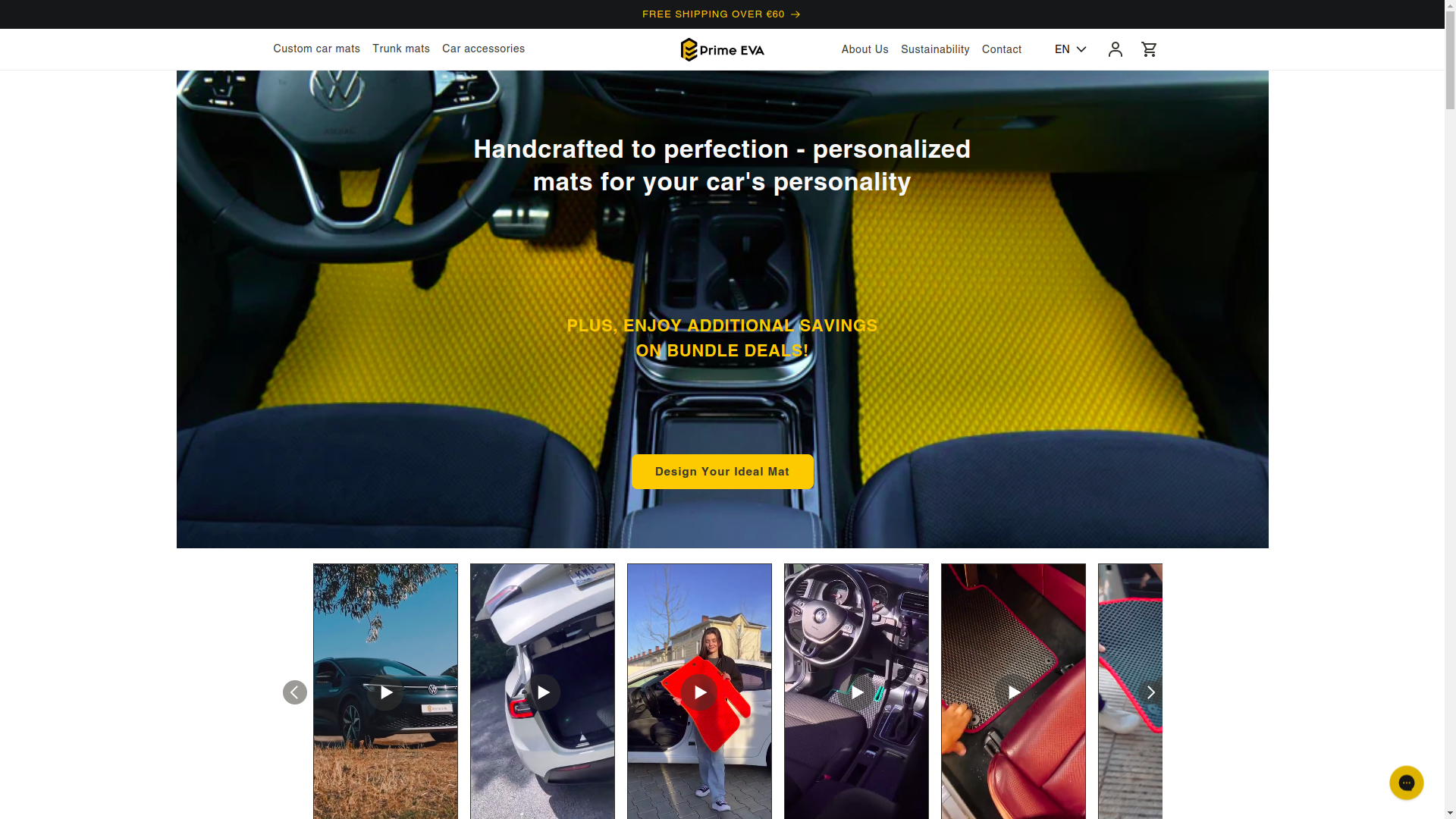
In spirit, this is a story at the intersection of several of our directions at once: AI/ML, corporate systems, and production solutions. If you are interested in projects close in architectural complexity, also take a look at FRACTAL, NaturalTTS and Prime EVA.
What the public part of the service looked like
The public area had to solve several tasks at once. First, explain the unusual idea of the service without heavy instructions and without the effect that this is some kind of techno-cult from the future. Second, gently guide a person toward registration without breaking the emotional tone. Third, reduce anxiety in advance: the user must understand that the service is serious, careful, and understandable.
That is why the interface, from the first screens, was built around clear visual accents, predictable navigation, and smooth transitions between steps. When a product's subject is sensitive, you cannot simply throw in buttons and hope that a person will figure it out on their own. Here, UX (user experience) must work almost like a good administrator in a live service: calmly, politely, and without unnecessary noise.
The next important point is trust. In products like this, the interface must look not only modern, but also substantial. A person should read that behind the screen there is not a makeshift builder, but a well-thought-out system with infrastructure, access rules, and real technical discipline.
We designed almost all first screens so that the user's complex path felt simple. This is an important difference. Making a technically complex system simple is easy. Making it so that it does not look complicated is engineering of a higher class.
Here it is clearly visible how visual presentation helps the user stay within the scenario. We deliberately made the interface conversational: not chatty, but precisely conversational. That is, the service constantly explains what is happening, where to click, what to expect next, and what state the process is currently in.
This event-based interface logic is especially important in long funnels. In an ordinary offline service, there is an employee nearby who will help if the client gets confused. In a digital product, this employee must be built into the screen. Through modal windows, status messages, neat alerts, hints, secondary navigation, and microcopy that does not irritate, but guides the user forward.
As a result, the public part turned out to be not an empty showcase, but a service with character. Not the kind of application for which you need to separately record a 40-minute video lesson so that a person understands where to click. But that very product that almost imperceptibly brings the user to the target action.
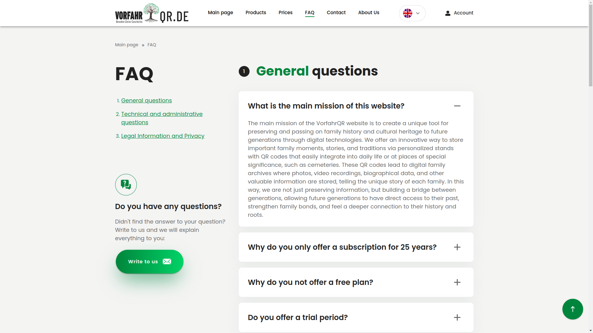
Question base, dialogue with the user, and service pages
User question base
Below is a screen where you can review the existing user question base. Such a section reduces the load on support and at the same time increases trust: a person sees that they are not alone with a complex topic and that the system can answer in advance.
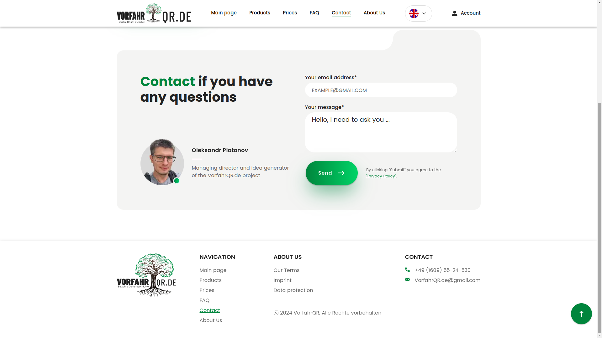
Panel where you can ask your own question
The next screen is a separate panel for sending a question. This is a good example of how even a simple support module becomes part of the overall architecture of trust. The user should not have to search for where to write, where to complain, or who even needs them. Everything is nearby, everything is in place, everything is human.
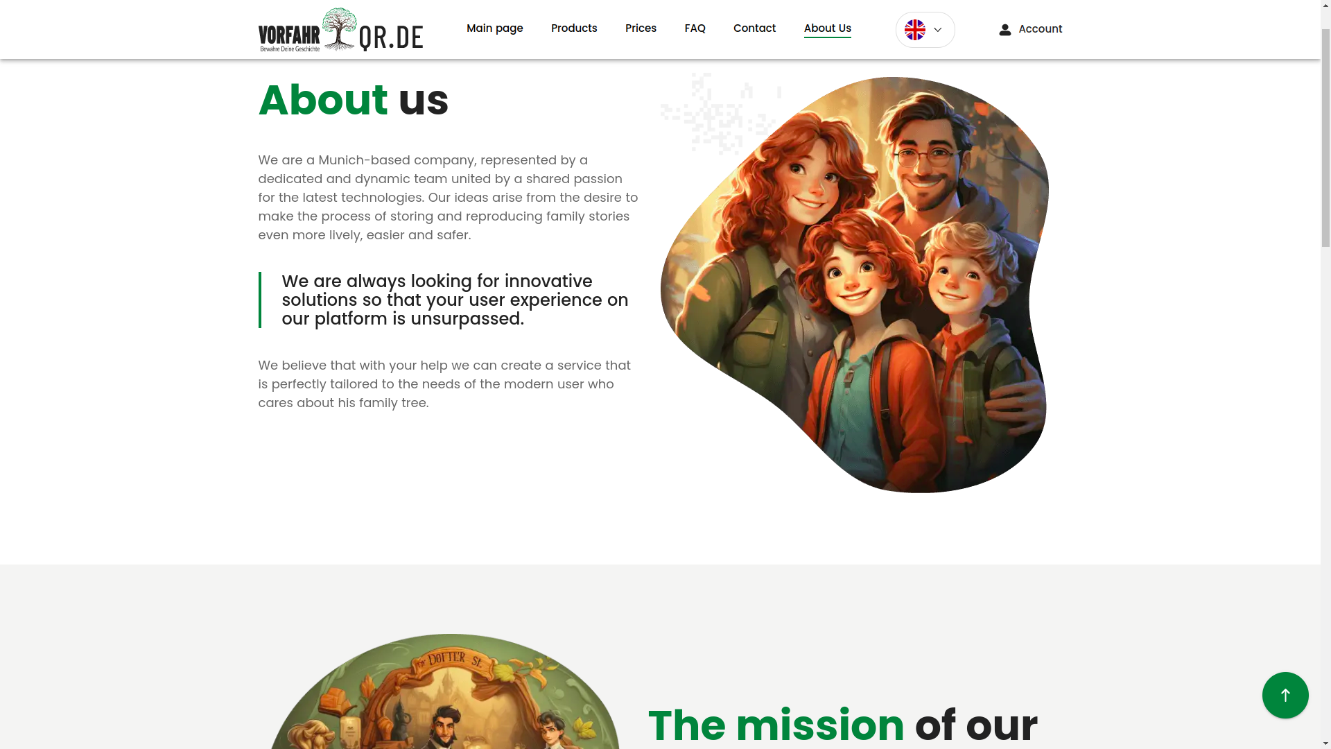
Company page
The About Us section was not made just for the sake of ticking a box. For such a service, it is an important layer of legitimacy. The user should see that in front of them is not an anonymous form on the internet, but a brand with a face, aesthetics, and clear presentation.
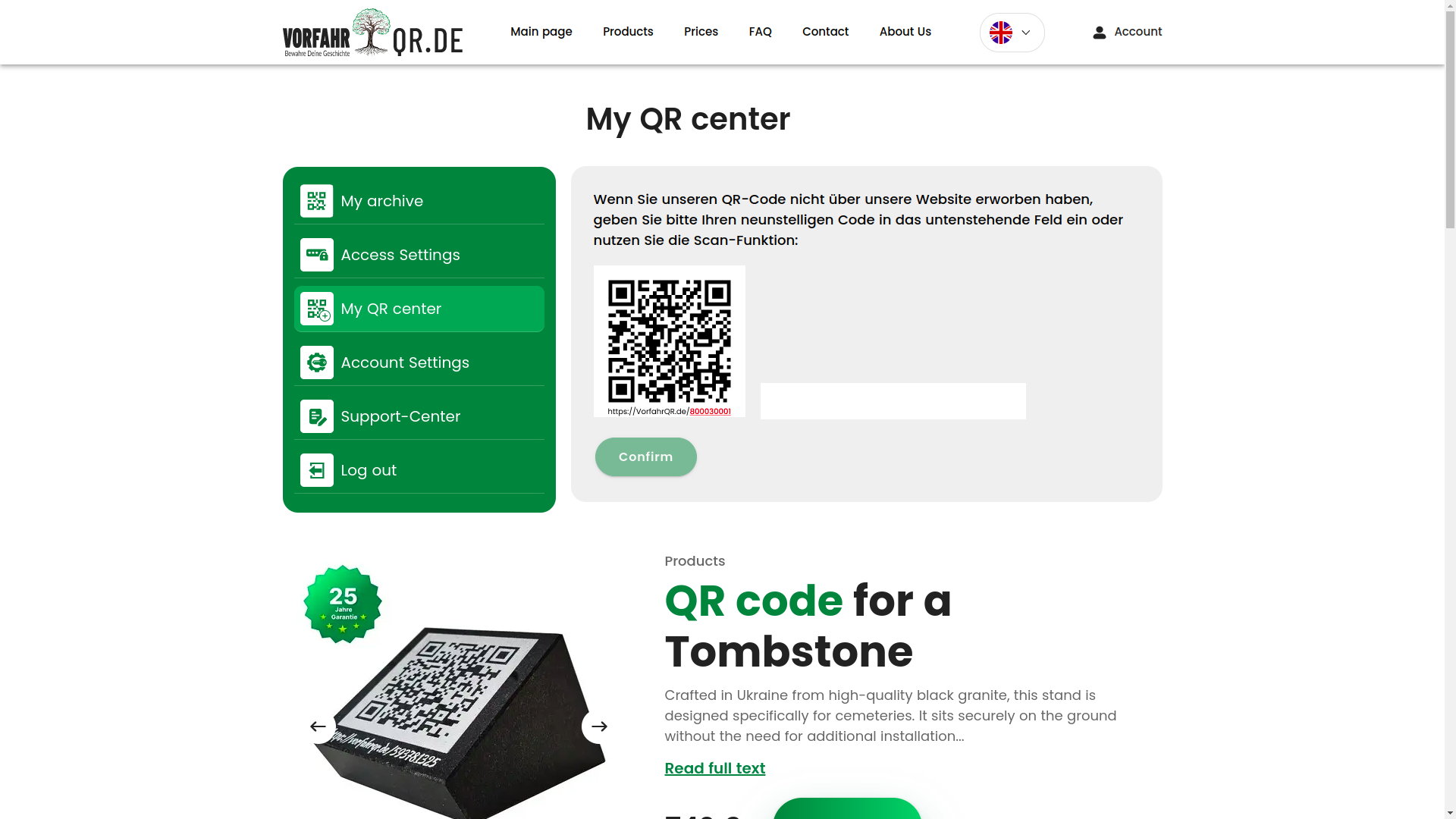
QR center, support, and account
QR center with scanning
The QR center is one of the key technical nodes of the product. Here the user can receive a QR code, scan it, and go to the linked entities. In essence, the QR code becomes a bridge between the physical object and the digital profile. That is, a small square on the carrier opens a full-fledged page with data, media, and history.
QR center with selection of a linked product
The next screen shows that the system can not only read a code, but also link it to specific entities inside the service. This is no longer a decorative QR code, but a working identifier inside the product's digital model.
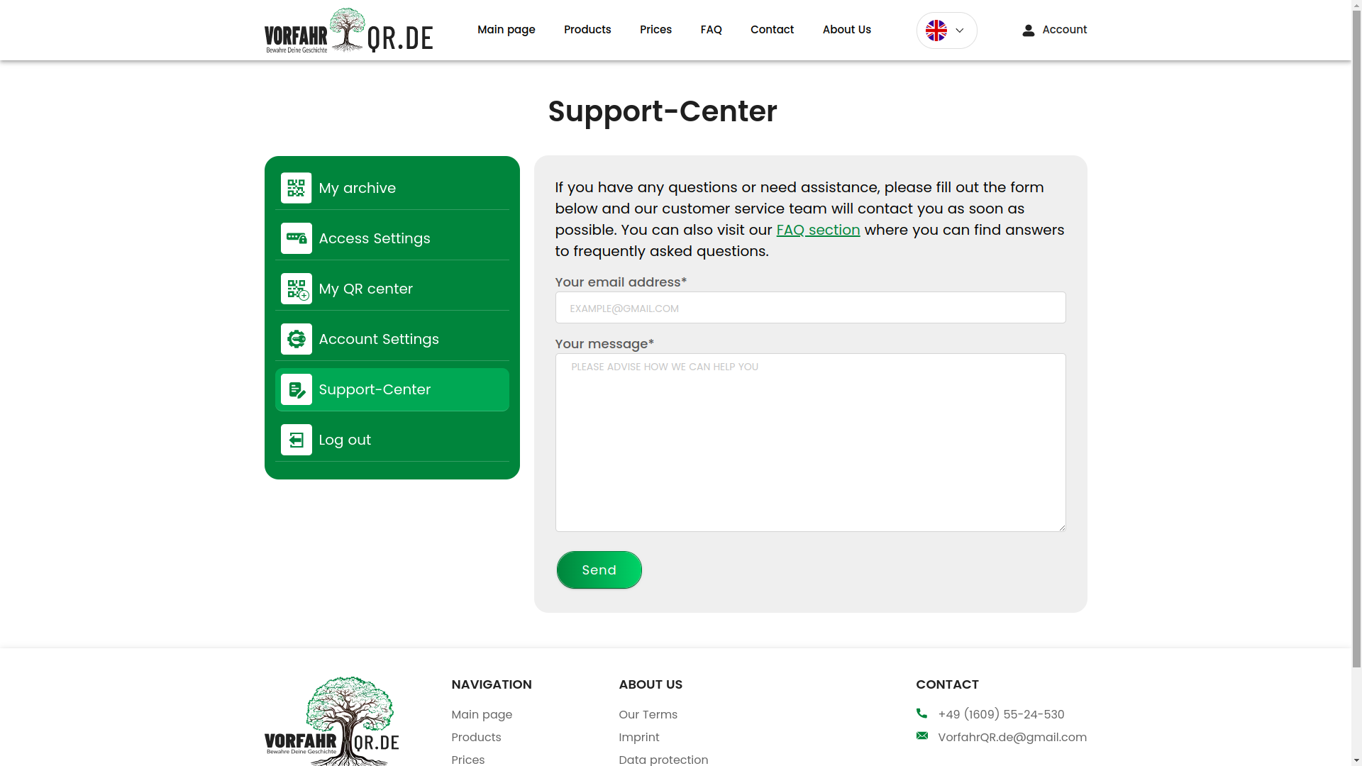
Support center
The support panel collects feedback from the service and the user. For a SaaS platform, this is critical: without such a channel, the product quickly loses manageability, especially when there are many states, roles, and exceptional scenarios inside.
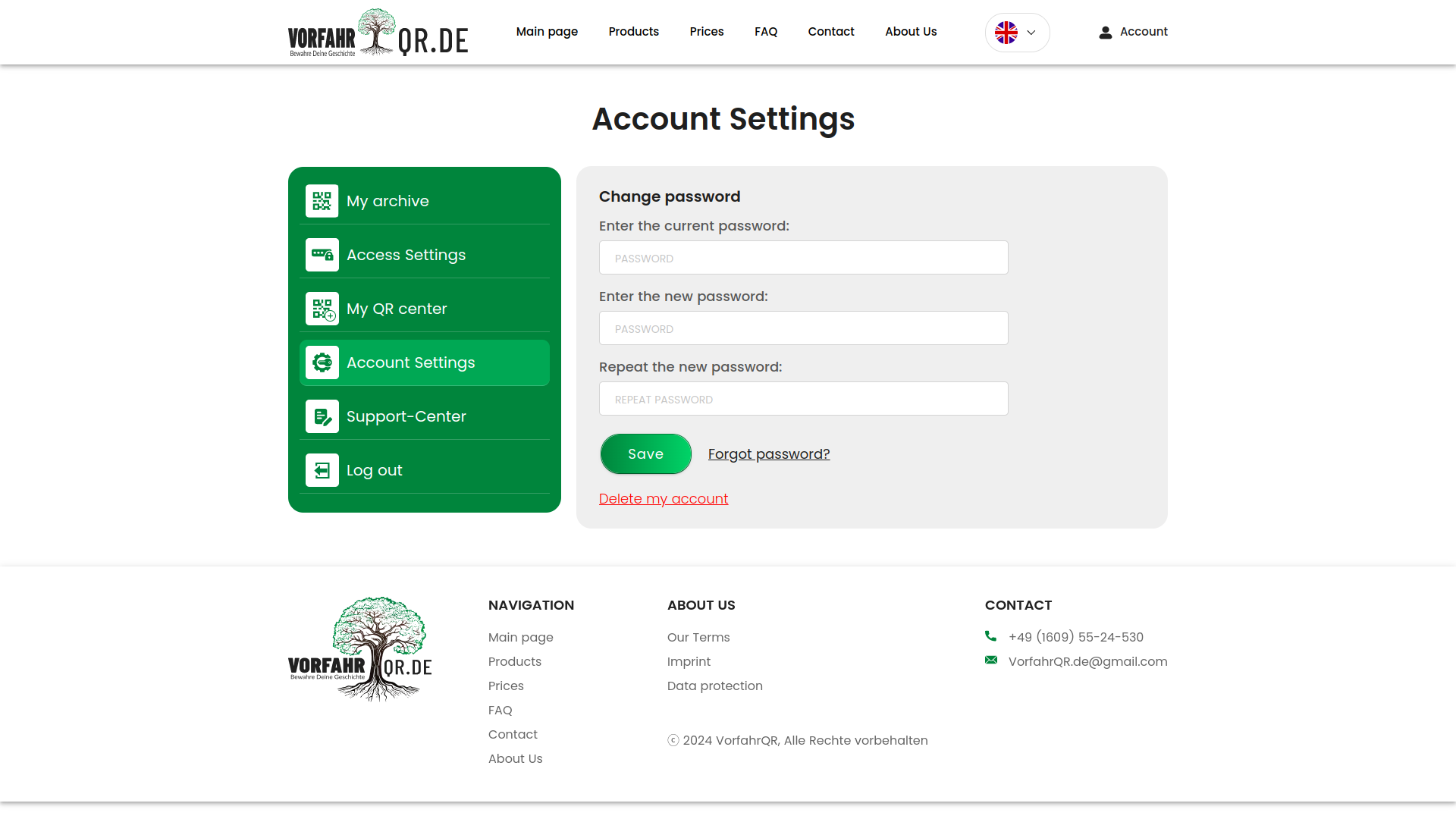
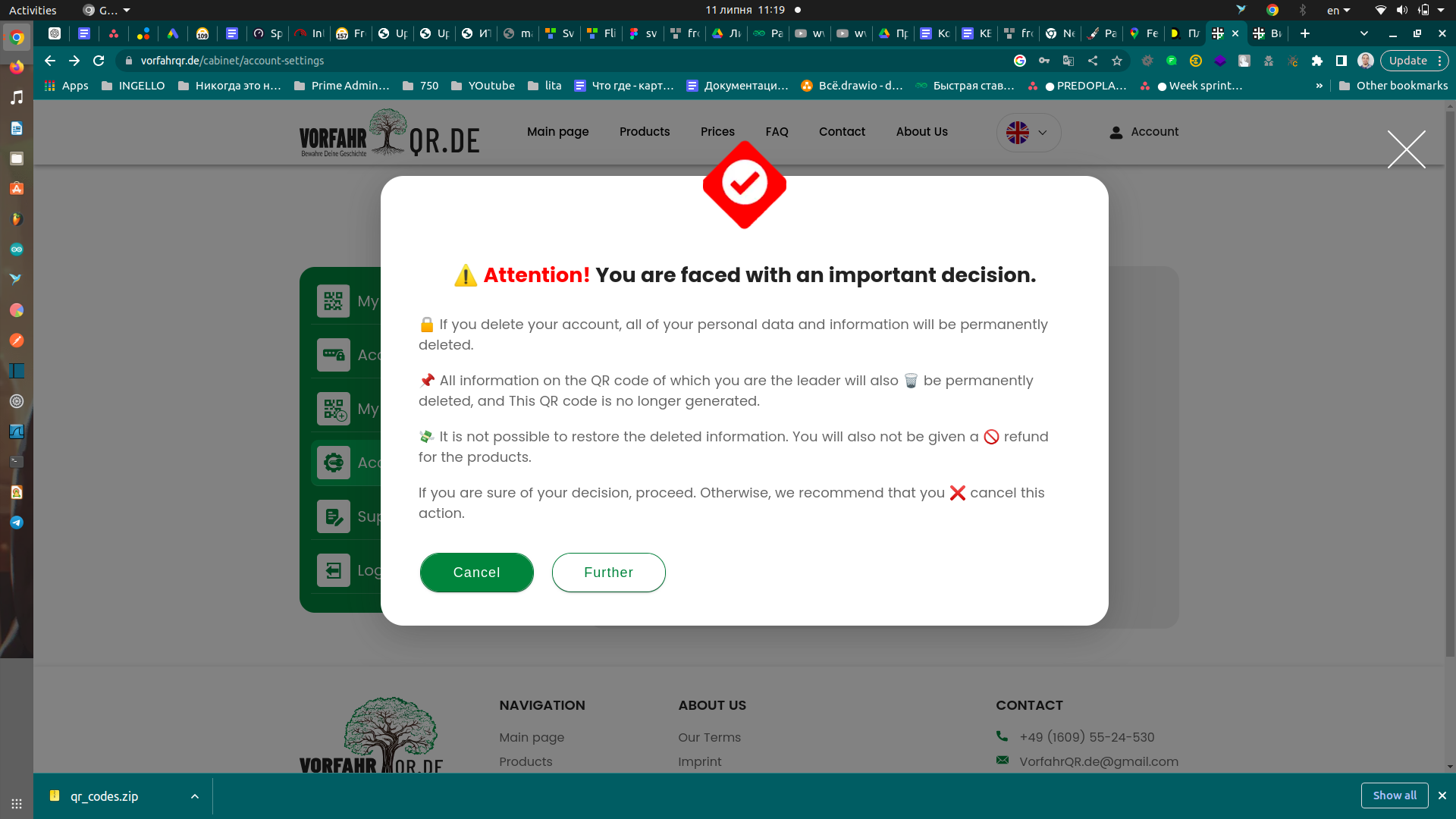
Account settings
Account settings look standard, but it is exactly these screens that often show the maturity of a product. Password recovery, credential management, basic security, and predictable scenarios should not be a heroic feat by a programmer, but the norm.
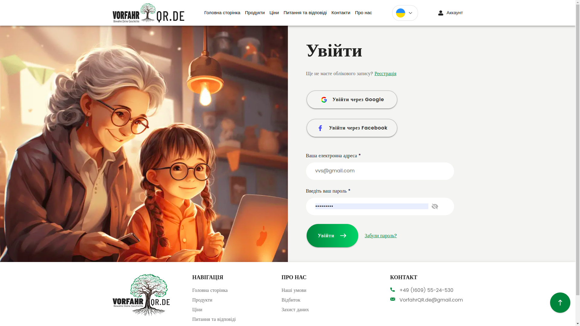
Login via social networks and by username
We implemented a login panel with several authorization options: via Google, Facebook, and the classic login/password pair. This is an OAuth flow (when login is entrusted to an external provider, and we securely receive identity confirmation), which always requires careful integration and attention to edge cases.
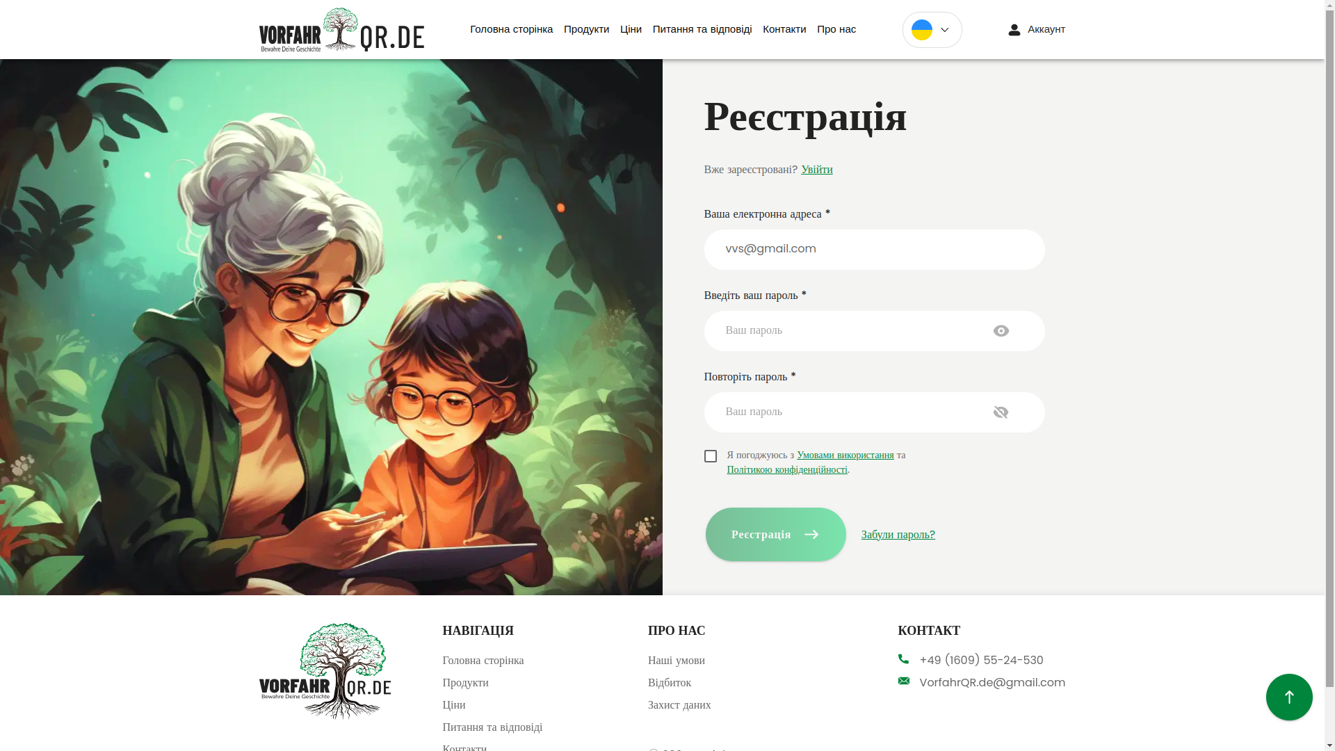
Registration with validation
Registration was also thought through not just formally. A beautiful form is pleasant. But validation (checking data correctness before submission) and a clear interface response to errors are much more important. The less afraid the user is of making a mistake, the higher the conversion and the less they hate the internet as a whole =).
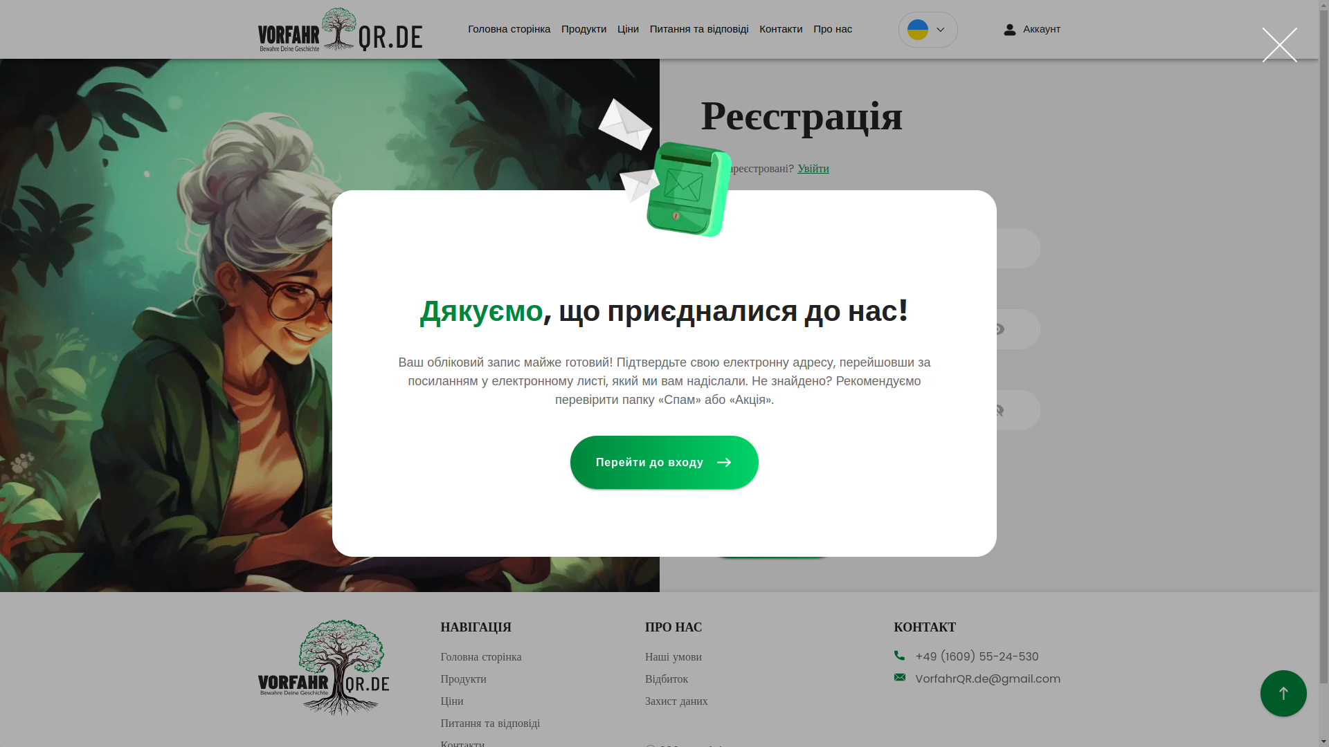
Positive notifications
After registration, the user receives not a dry system response, but a neat designer notification with thanks. This is a small thing only on paper. In practice, it is precisely such things that shape the feeling of a high-quality service.
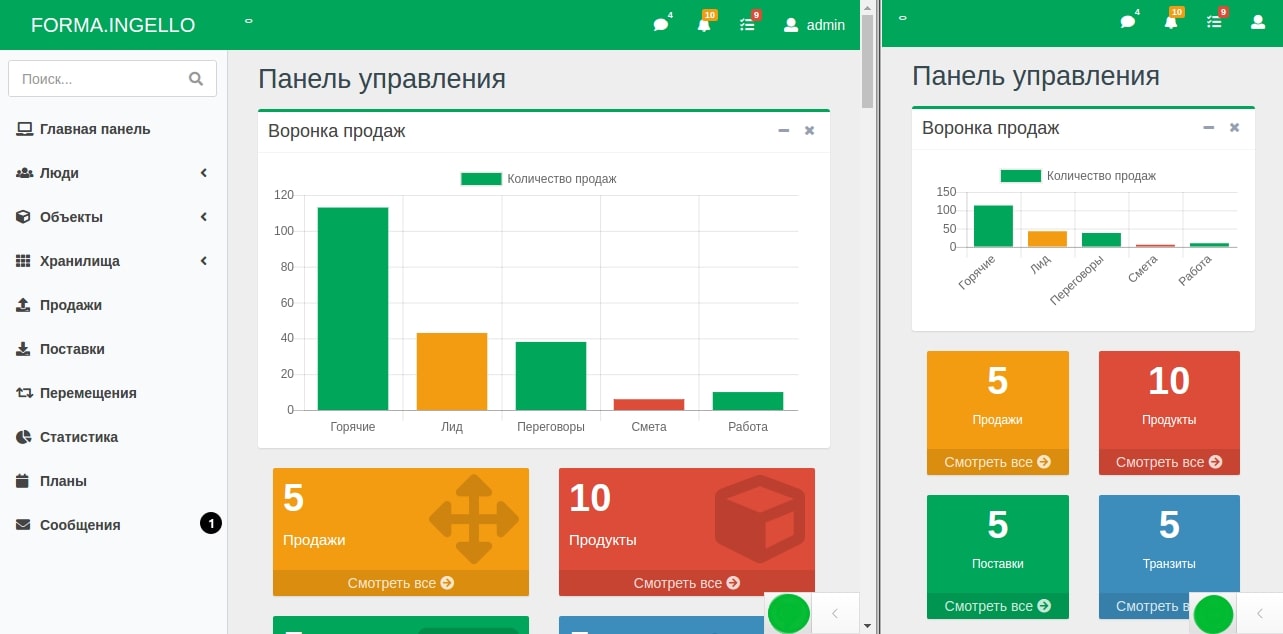
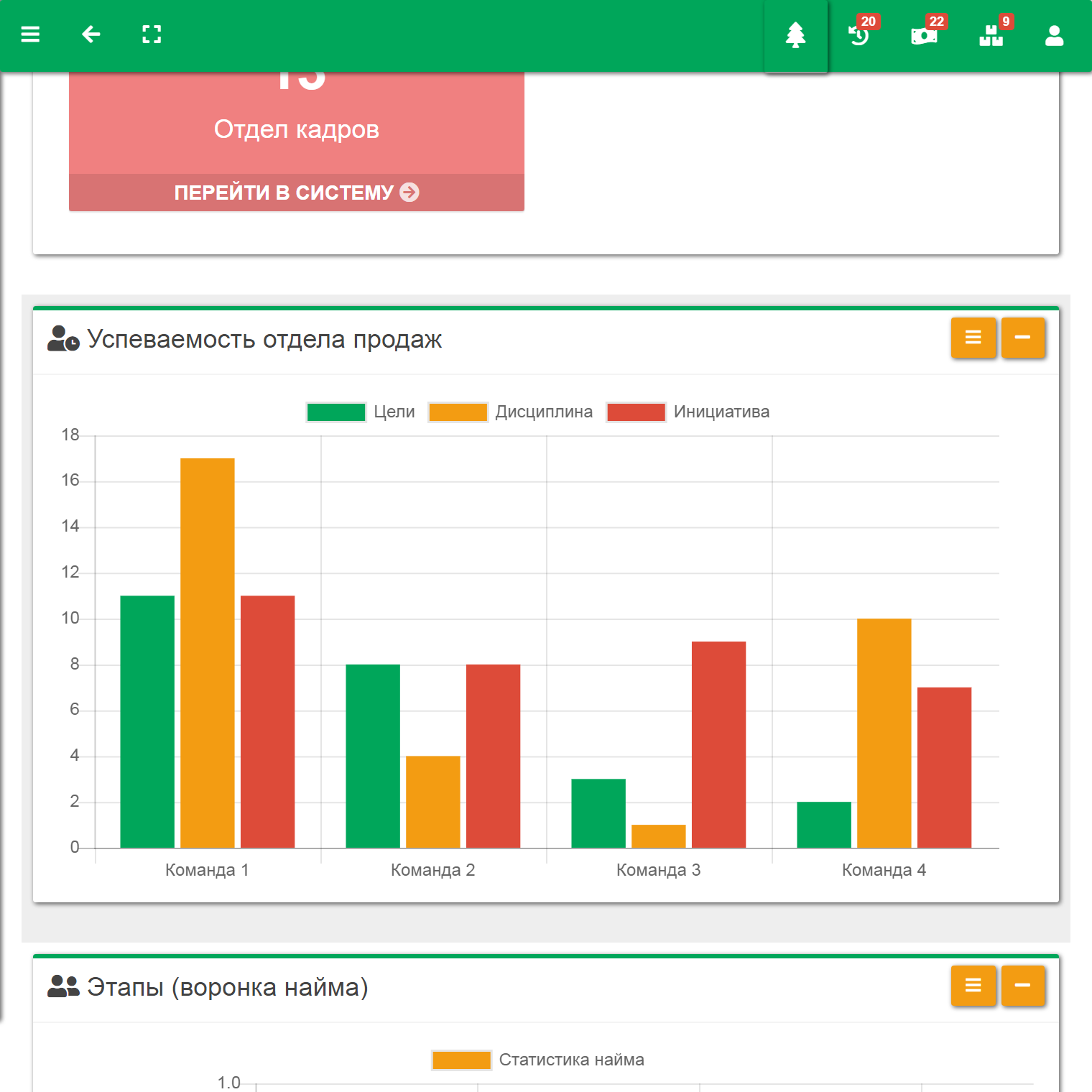
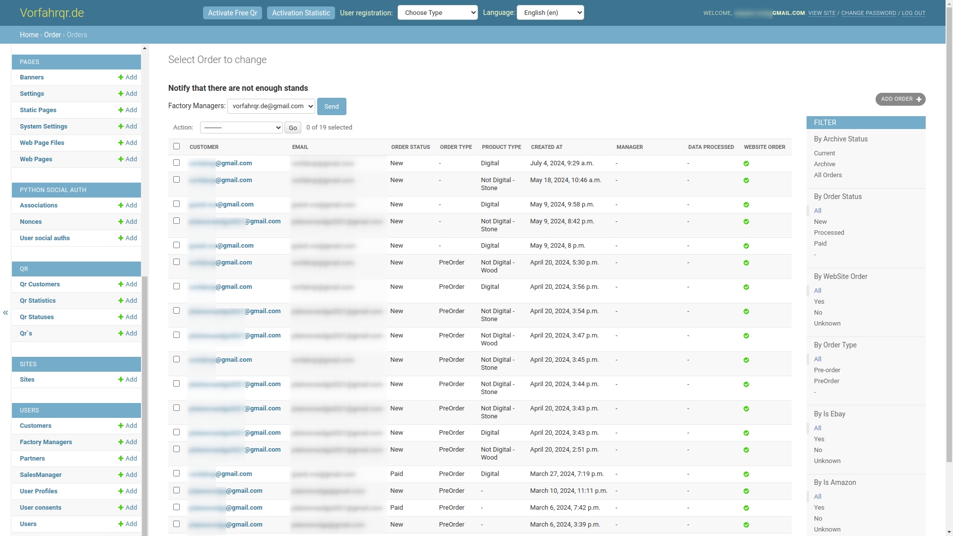
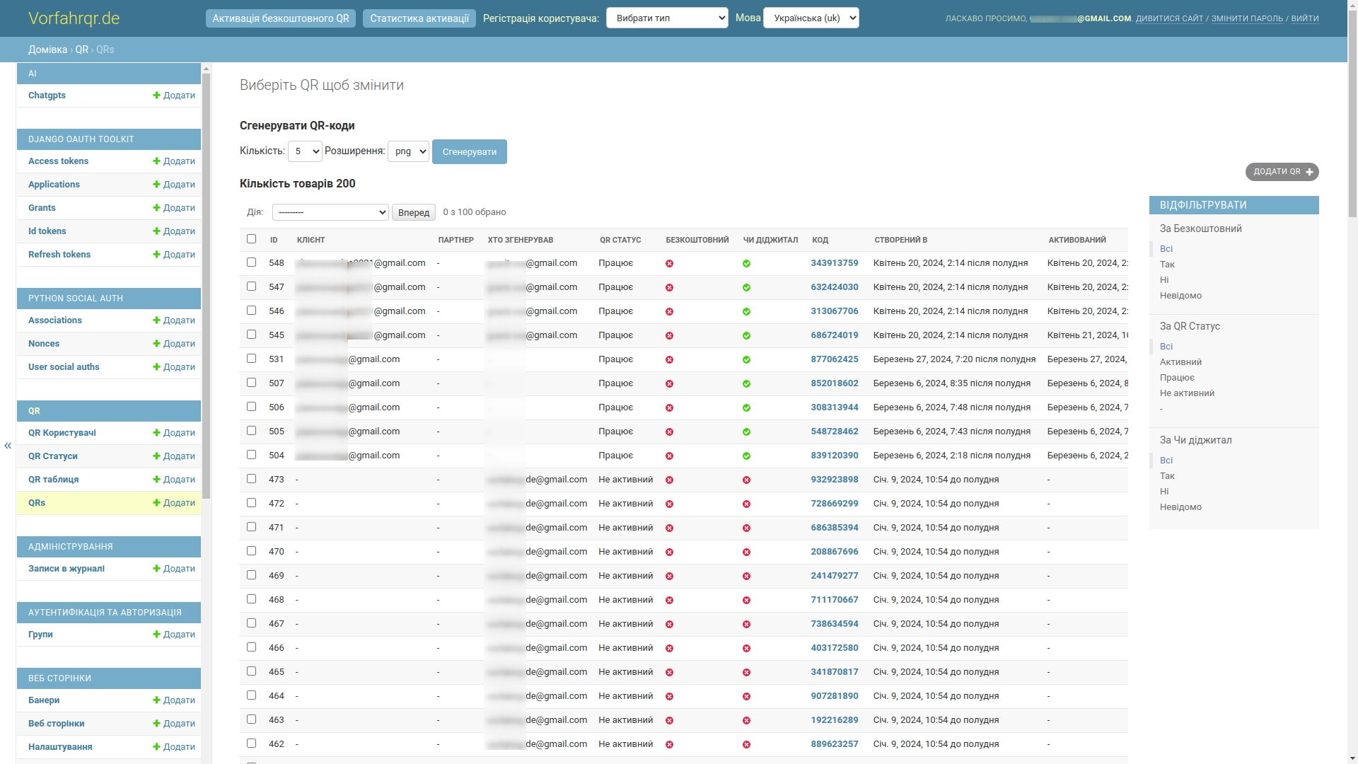
Administrative area and internal contour
From the outside, the service looks aesthetic and light. Inside, it is already completely different music. That is where real applied engineering begins: tokens, users, statuses, tables, production entities, warehouse, stock balances, administrative permissions, and service settings for AI modules.
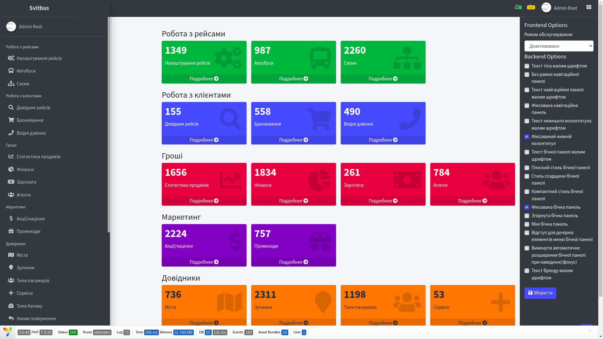
It is exactly these sections that show whether the product was truly built as a system or whether it is just a beautiful facade. In Vorfahr, it was precisely a system. In terms of internal organization, the project is in places closer to corporate solutions like platFORMA and FORMA WMS, than to an ordinary marketing website.
Roles in the system were also separated not for decoration. Warehouse manager, manufacturer, seller, store, administrator — each has their own action contour and their own access level. This is already an RBAC model (role-based access control, meaning rights are built around roles rather than being chaotically handed out manually).
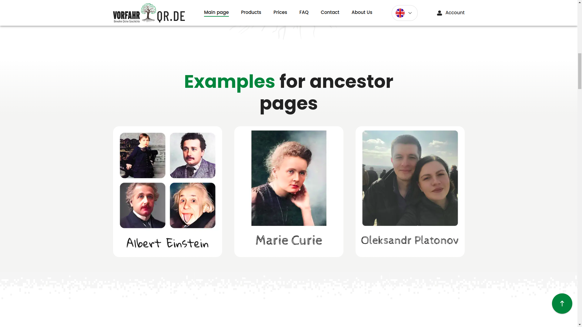
Archive, QR profiles, and page builder
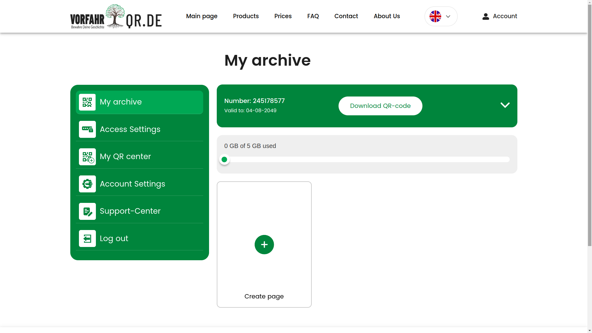
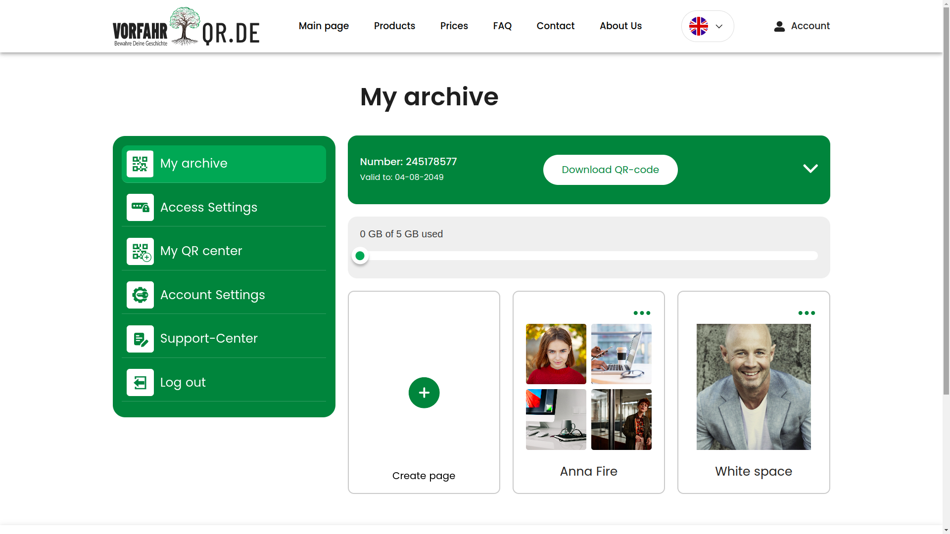
Page archive
The archive section is one of the central user areas. Here, a person works not with an abstract system, but with their own materials, profiles, and linked pages. This is an important transition from the idea of a service to real everyday value.
Selection of QR codes and linked profiles
The user can select different QR codes and see which profiles are attached to them. This connection between the code and the digital page was one of the key meanings of the project: the code has not only a visual form, but also a lifecycle inside the system.
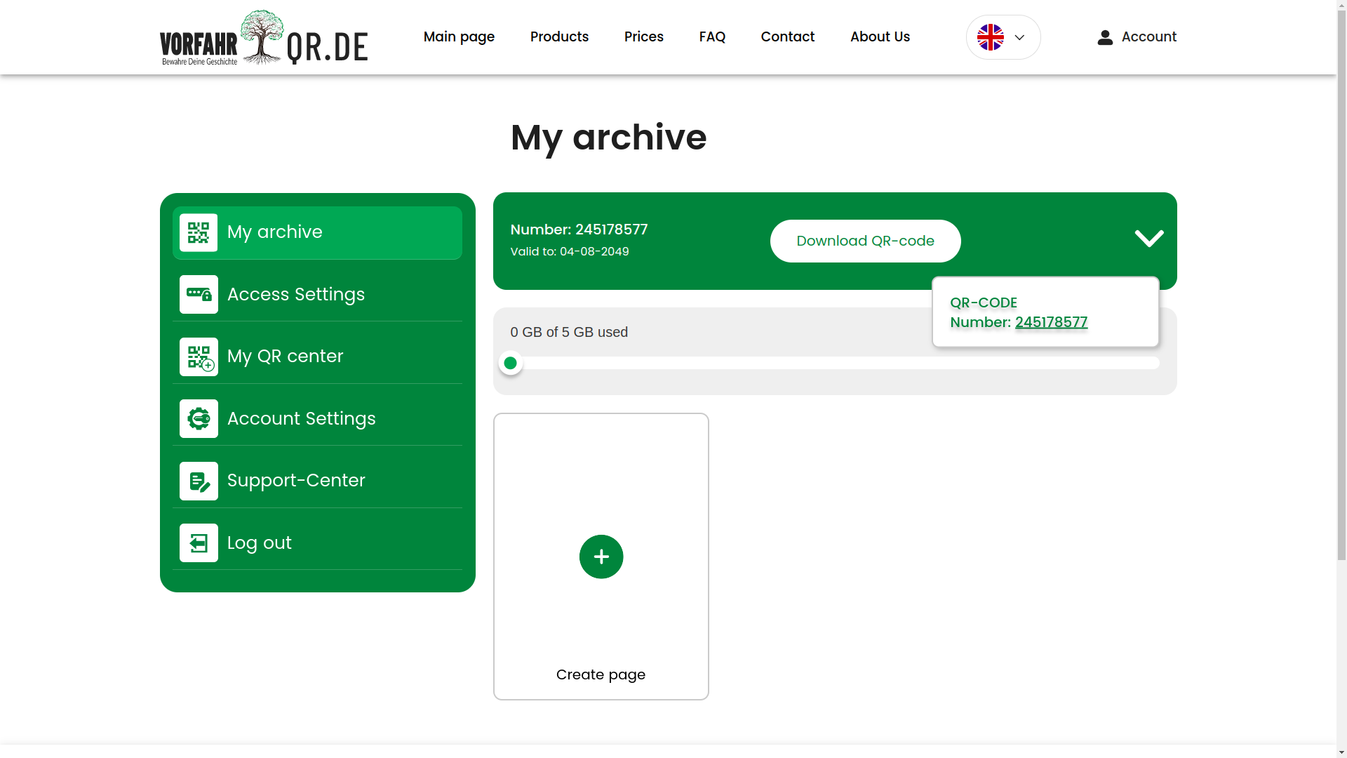
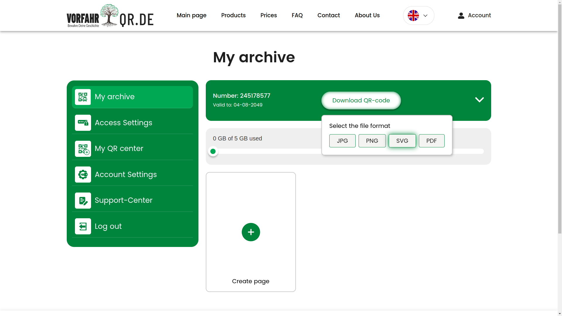
Downloading QR in different formats
A separate plus is the ability to work with QR exports in different formats. This is convenient not only for the user, but also for operational processes, when the code needs to be sent to print, forwarded to a partner, or embedded into another process.
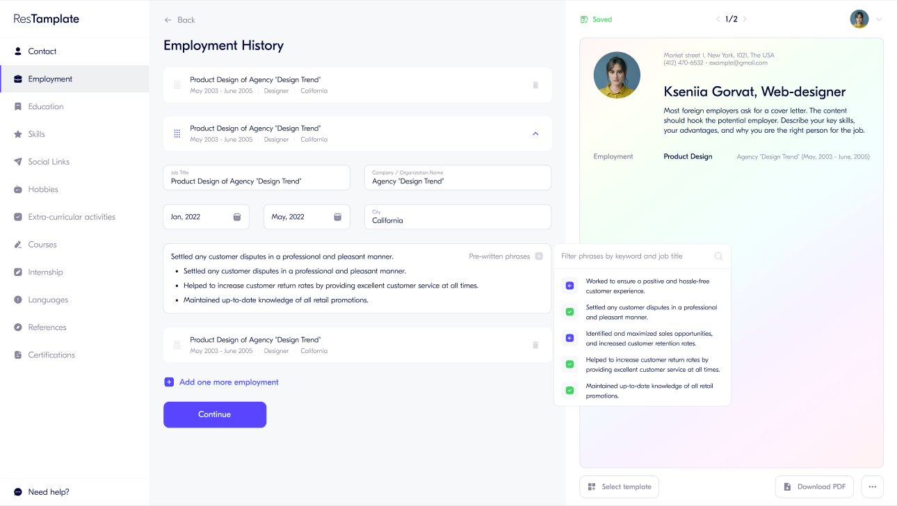
WYSIWYG page builder
Next comes one of the most interesting modules — the visual page editor. This is a WYSIWYG approach (what you see is what you get, meaning you edit and immediately see almost the final result). In feel, it is closer to Tilda or Wix, but tailored to a specific subject area and integrated with the service logic.
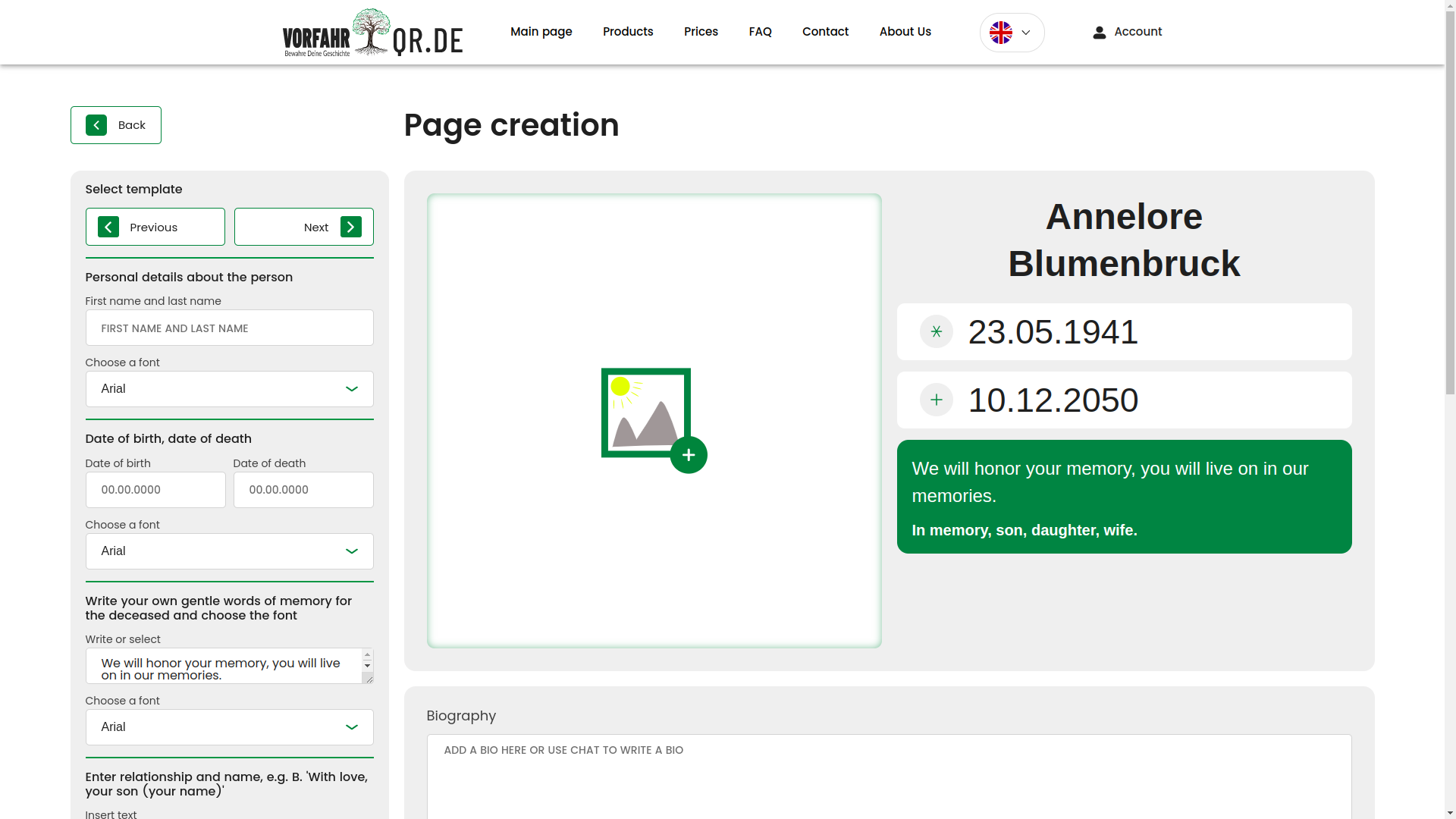
The user can write text, set dates, choose fonts, add images, configure blocks, and immediately see how it will look on the finished page. This mode lowers the entry threshold: a person does not need to understand the technical structure of the template; they work almost as in an editor, while the system under the hood already assembles a correct result from it.
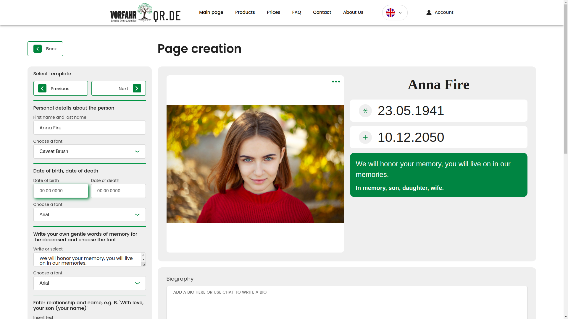
Uploading photos
Working with images was a separate large scenario layer. Below is the photo upload field, from which the entire further processing pipeline begins.
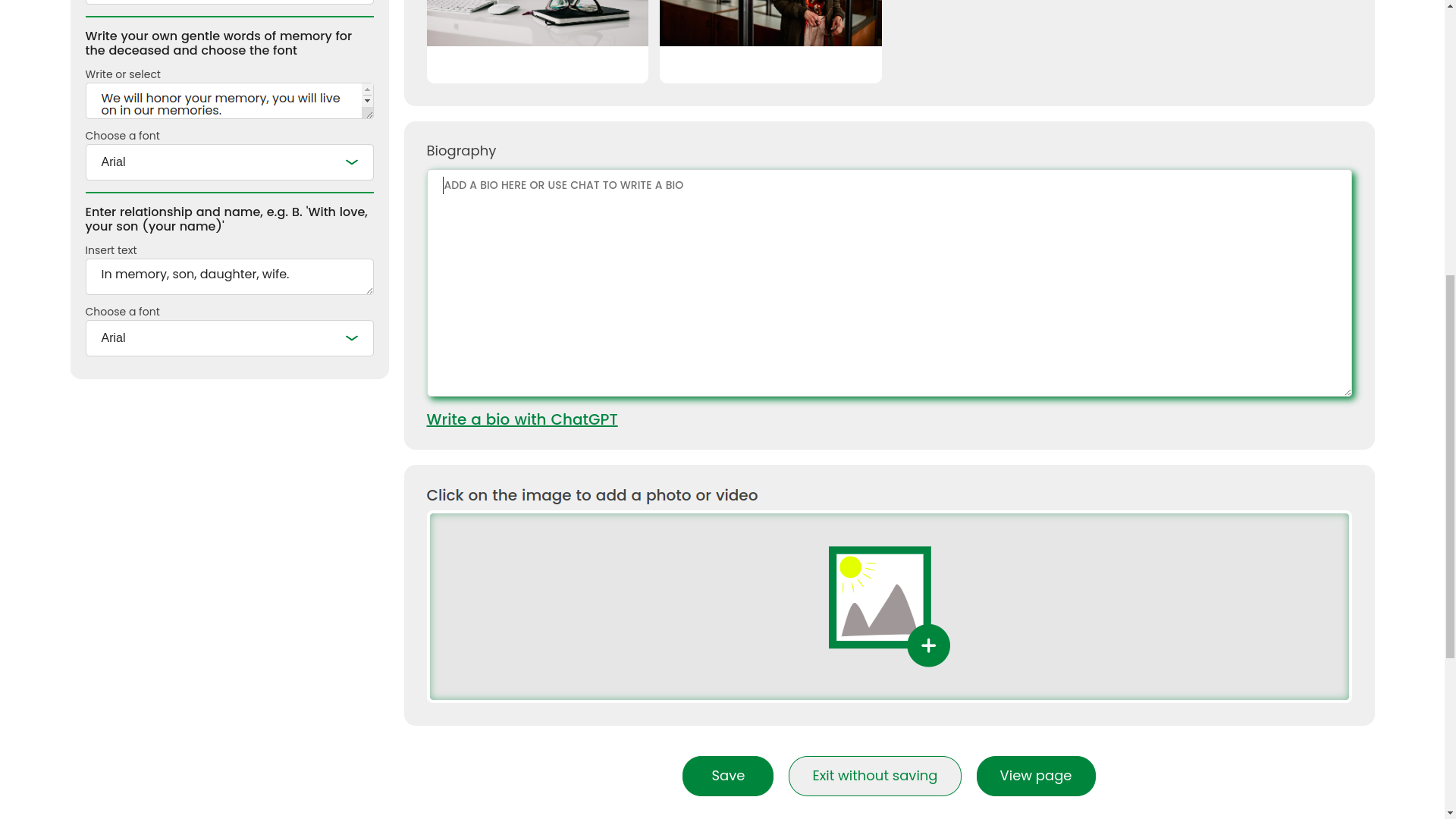
Photo slider
After uploading, the user can conveniently view photos inside the interface without dropping out of the overall page editing scenario.
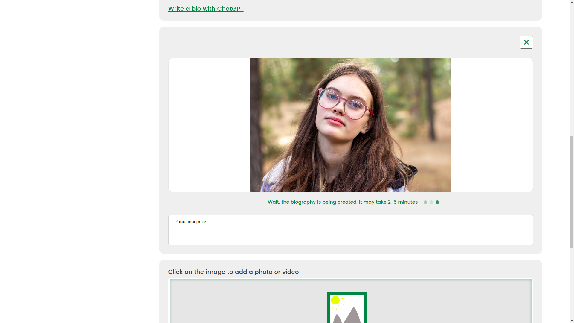
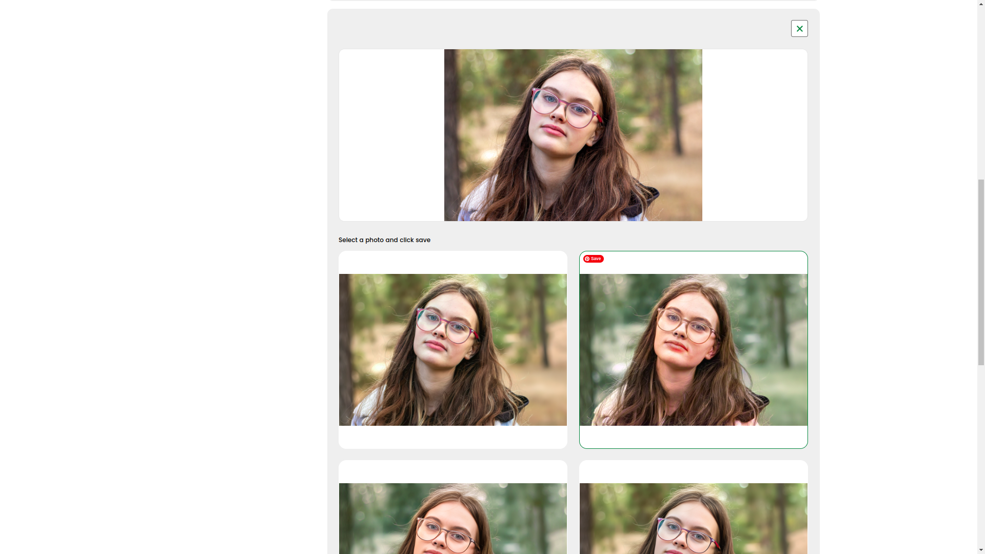
AI photo enhancement
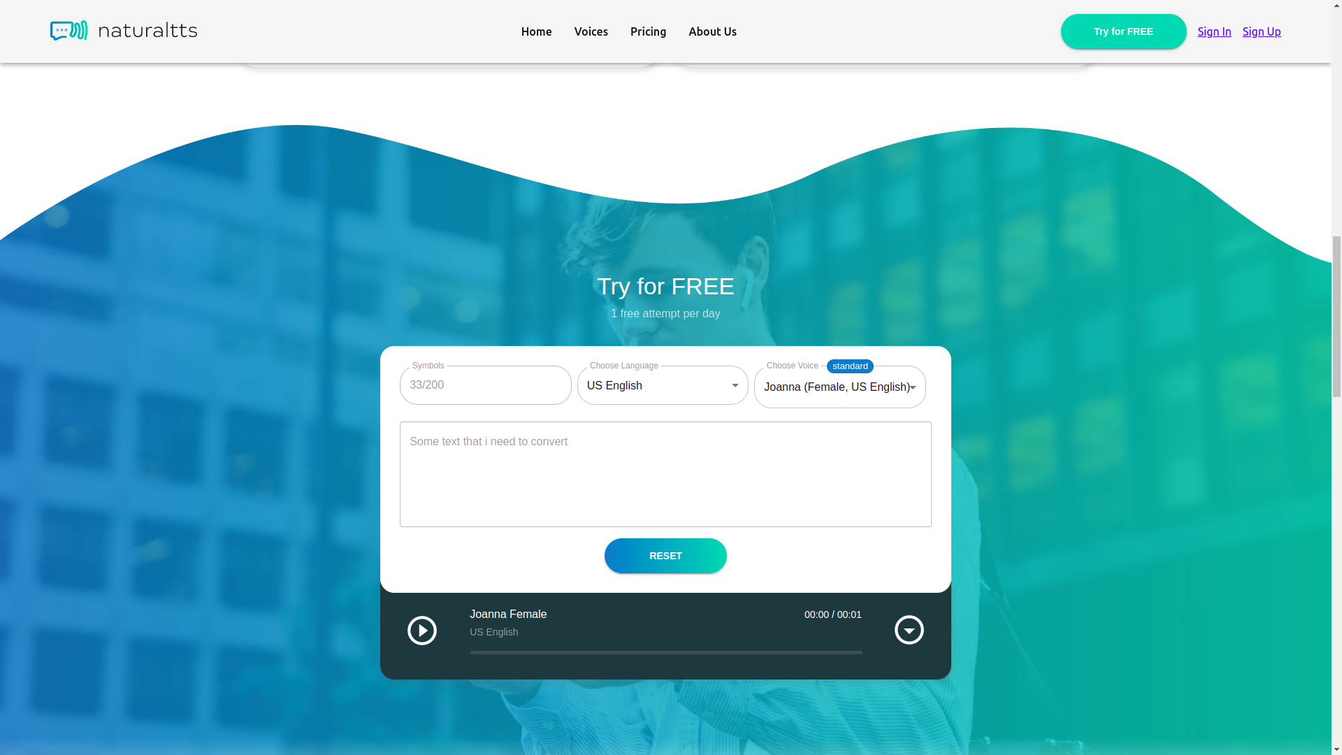
And here the magic already begins, but utilitarian magic, not marketing magic. With AI, the system can enhance photos: remove defects, restore old shots, make black-and-white photos color, offer several result options, and let the user choose the best one — directly in real time.
That is, AI here is not drawn in a presentation with a marker, but built into a working user scenario. It is exactly for such applied things that we especially love projects at the intersection of interfaces and machine logic. If you are interested in related cases on automation and AI, be sure to look at FRACTAL and NaturalTTS.
Other data input methods
The builder was not limited to a single interaction format. We also provided other data input methods so that the user could assemble the page in the way that felt closer to them, not in the way more convenient for the developer.
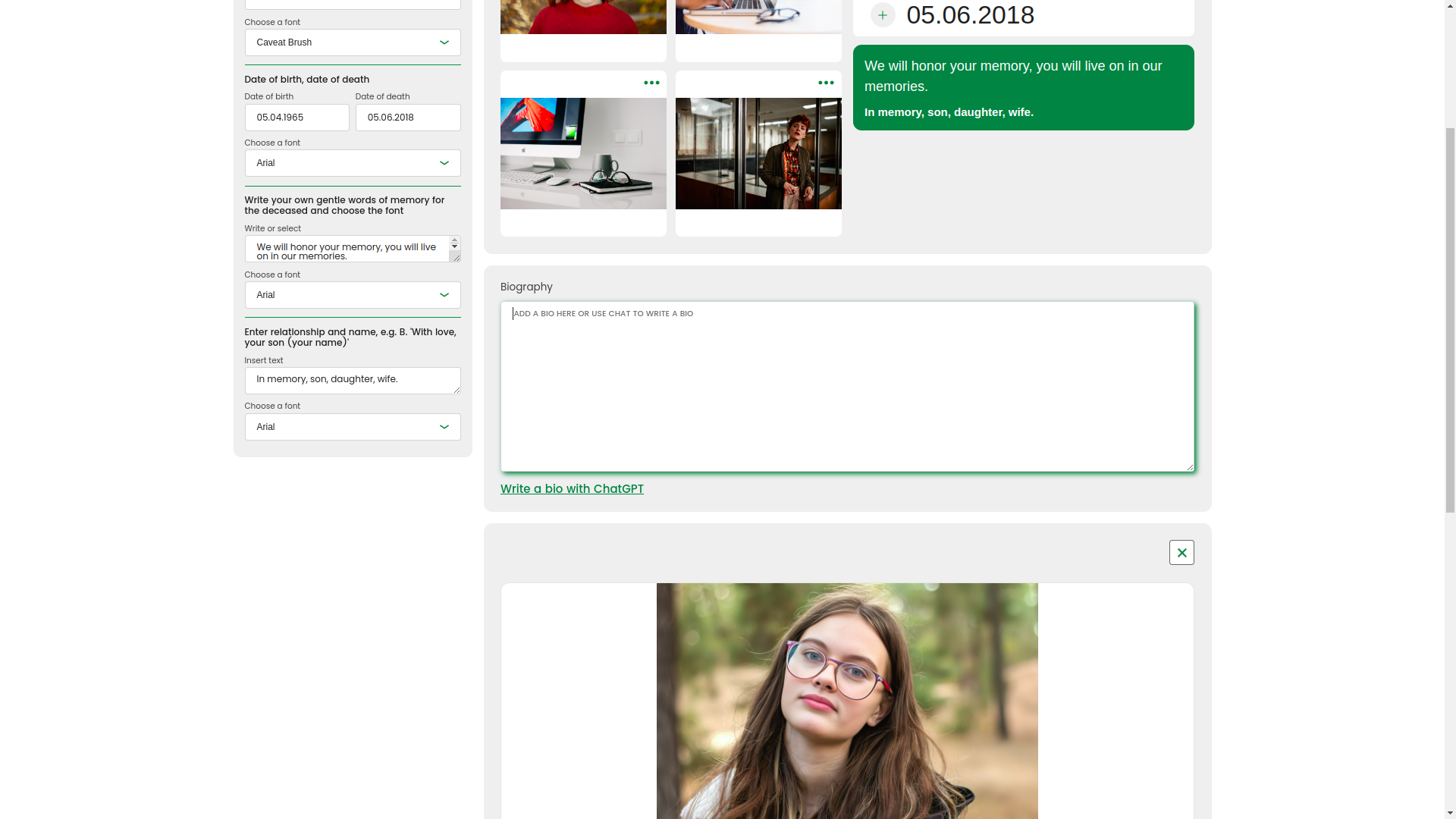
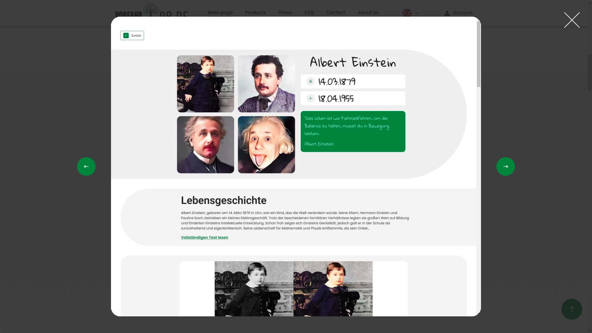
Biography generation via LLM
A separate strong module is writing a biography with the help of an LLM. At the time of development, the OpenAI GPT model was used. Moreover, the text appeared not as a dry block at the end of the request, but interactively, letter by letter, with a live typing animation. This effect makes the interaction not only technological, but also emotionally understandable.
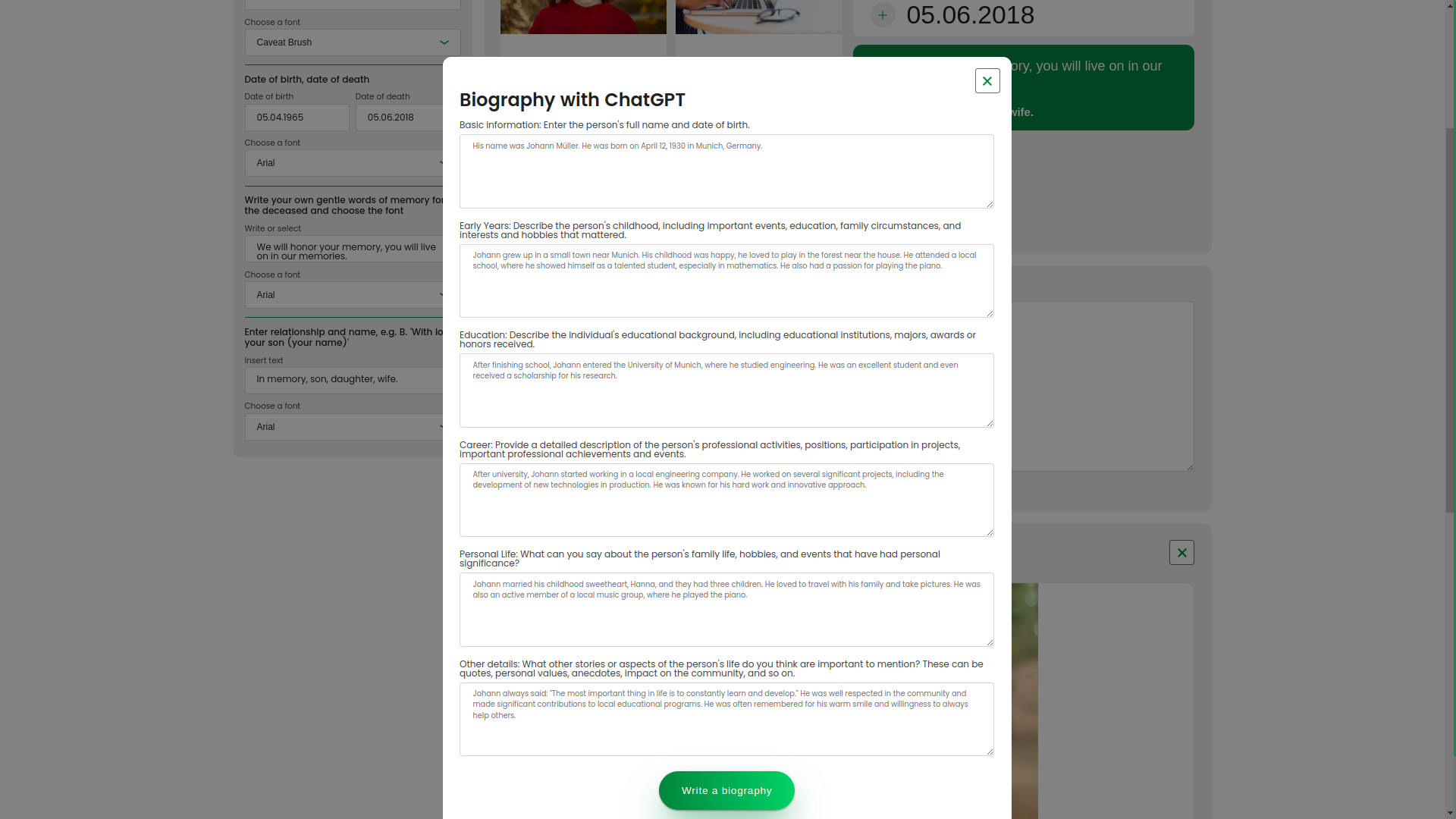
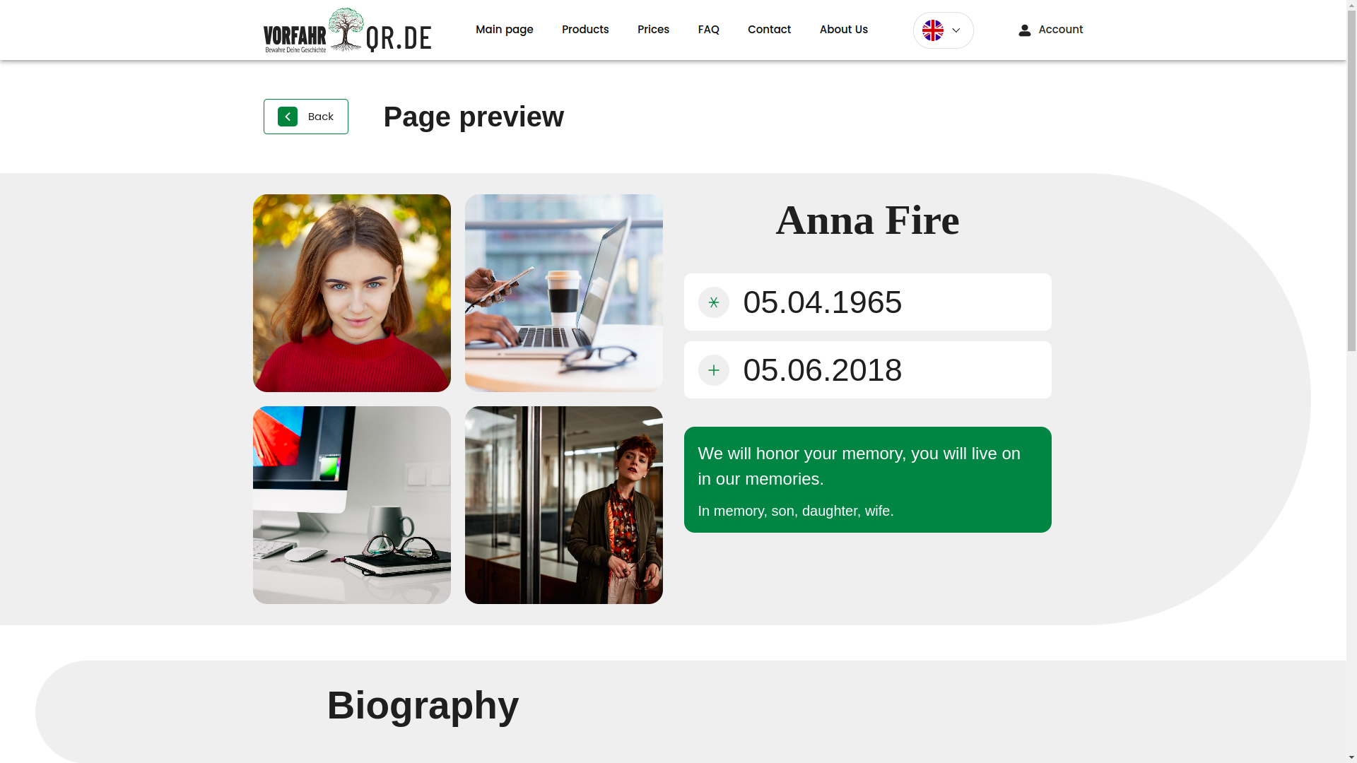
Page generation result
Below is the result of the builder's work. This entire logic was built precisely for such a connection: a convenient editor, clear data input, AI assistance, and a neat output into a finished page that you are not embarrassed to show people.
Family archive and available space
The family archive system displays available space, lets you choose an already created biography or create a new one, and also links pages to specific QR codes. This is no longer just a set of cards, but a structured digital repository with connection logic.
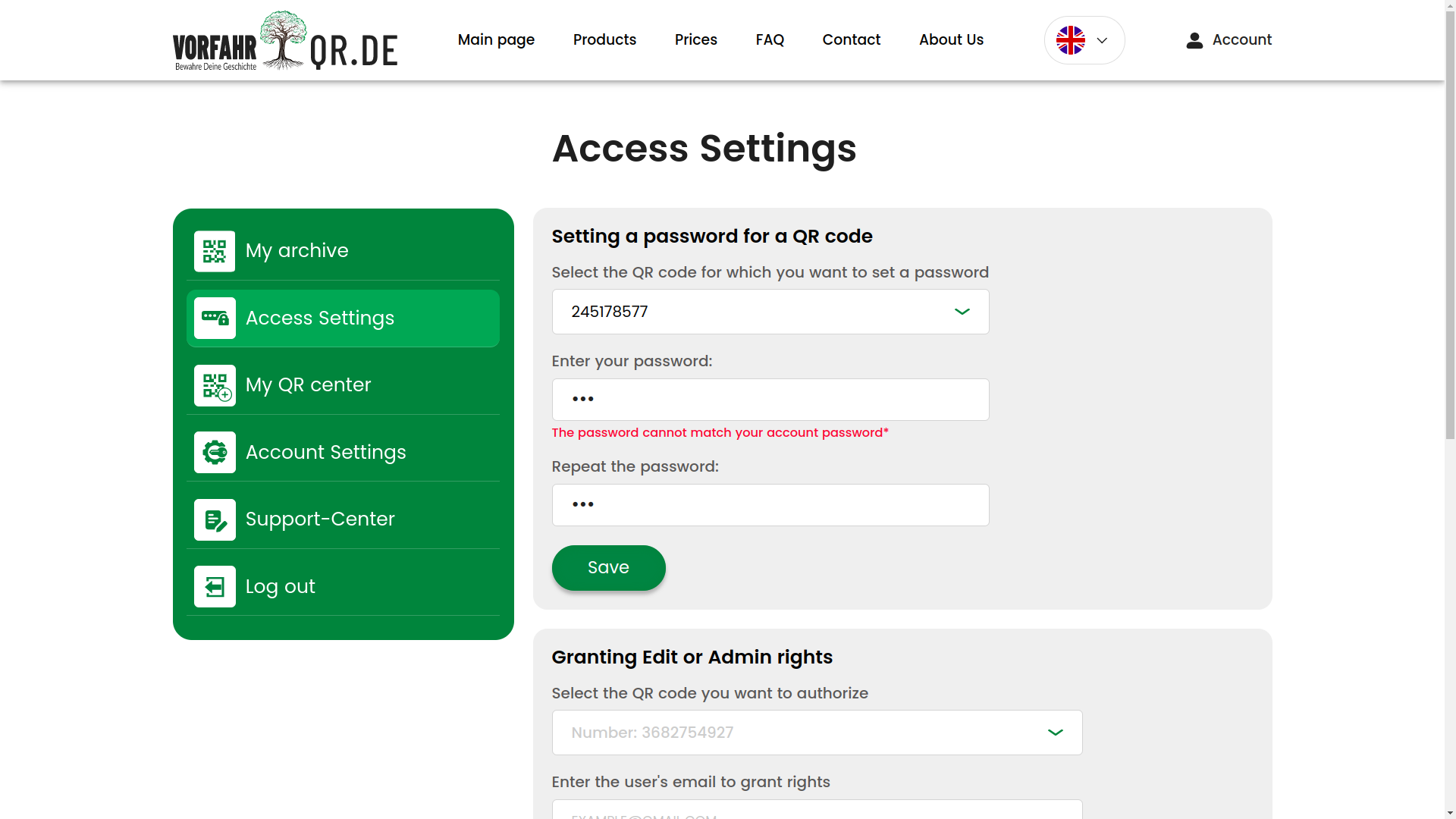
Configuring access to the page
Access parameters are brought out as a separate screen: QR binding, password protection, administrative rights, and other security settings. For such a product, this is not an additional option, but a necessary part of the architecture of trust.
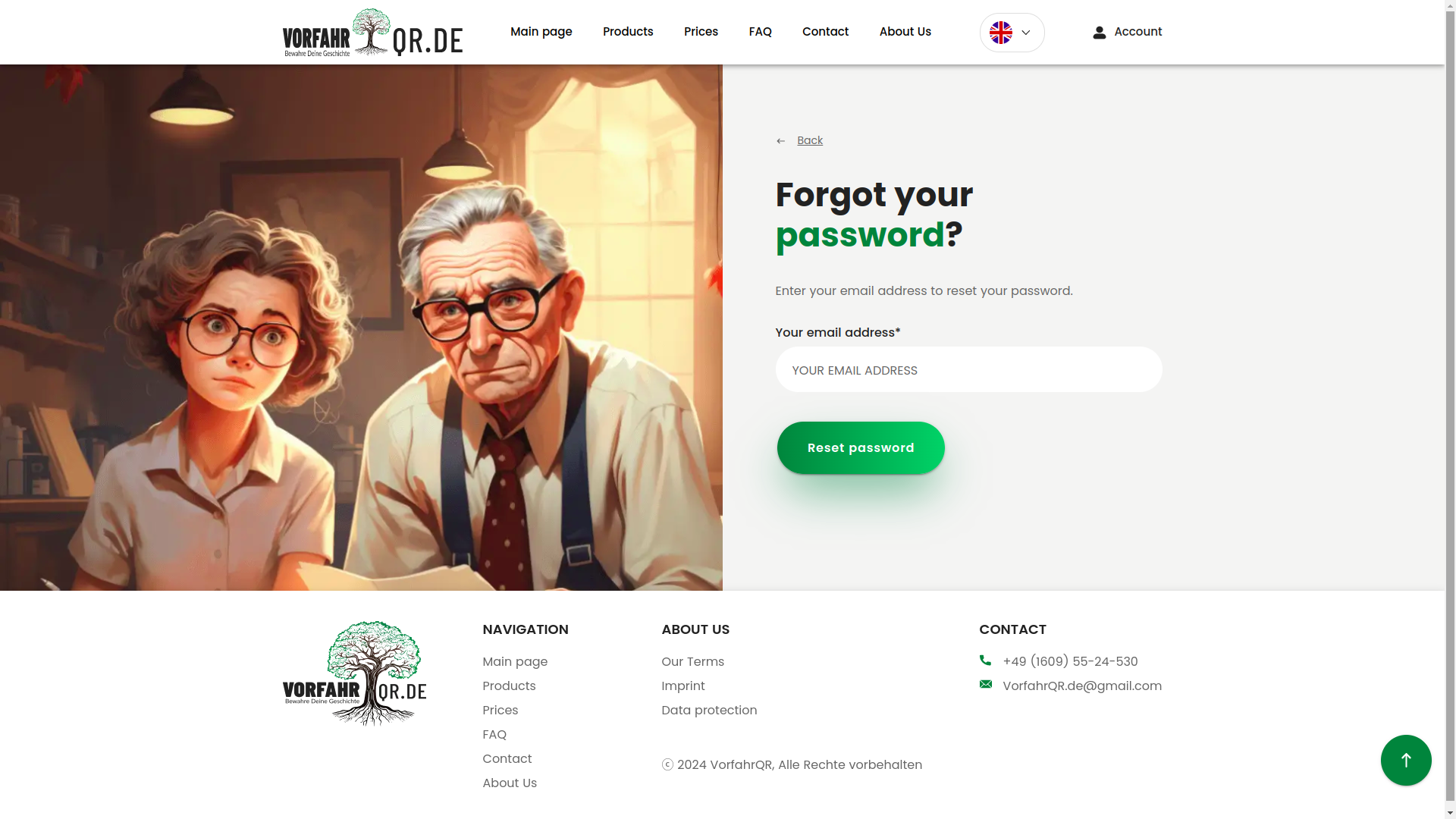
Password recovery
Password recovery is also done neatly and like grown-ups. Usually this is the section everyone considers boring until it breaks. We prefer it not to break =).
Designer notifications
Beautiful pop-up notifications with iconography are another example of how the service talks to the user at the right moment. In good products, even an error looks as if the system is trying to help, not accuse the person of existing.
Protected QR code generation
The QR code generation system was moved into a protected administrative area. This is important both for security and for production discipline: such entities cannot be handed out chaotically, otherwise digital order quickly turns into a cemetery of coincidences.
What difficulties we faced
1. Python, Django, and not the simplest server stack
The client was technically competent and understood well what they wanted. In particular, they insisted on a Python stack: the first version of the project was already being written in Python, and there was a desire to continue specifically in this direction. The server side was ultimately built on Django, and the hosting story was tied to Python Anywhere.
Let us put it carefully: Python is an excellent language for working with data, mathematics, automation, and AI. But in classic web development, the ecosystem of PHP frameworks like Laravel, Symfony, or even good old Yii2 has historically been richer in typical solutions, packages, and familiar tools. So we met the client halfway where it was reasonable, but in critical places insisted on a more stable architecture — for example, we made the frontend a separate application and connected it to the server via API (a set of doors through which two programs talk to each other).
2. Frequent design changes and cascading impact on logic
For startups and non-template products, this is normal: the design lives, ideas appear as the project progresses, new screens arrive after another part of the logic has already been launched. From the outside, it seems that some little thing changes. Inside, it often means a cascading restructuring of scenarios, data, and conditions.
We designed the system so that the average cost of change was manageable. Where needed, we made quick working solutions, and later laid down refactoring (that is, cleaning up and improving code without changing the business meaning). This approach lets you avoid dying of perfectionism in the early stages, but requires an honest conversation with the client about scaling risks before the technical stabilization stage.
3. A large number of external integrations
The project had several external contours at once: AI services, cloud storage, Stripe, OAuth, Google, Facebook, and other dependencies. On paper, it looks like a list of logos. In practice, it is constant work with documentation, discrepancies in real API behavior, registrations, confirmations, accesses, partner dashboards, and strange edge cases that no one loves, but somehow everyone gets.
It gets especially fun where an external service lives by its own internal laws and is not too eager to make integrators' lives easy. But in the end, the whole bundle was assembled and worked stably.
4. Lack of an ultra-detailed technical specification at the start
We were not working blindly. At the start, there were client requirements, clarifications, thought-through modules, functions, components, and a detailed design for desktop, tablets, and mobile devices. However, less time was devoted specifically to system analysis (the breakdown of business processes and precise formalization of entities) than we usually recommend.
Ideally, we like the design first approach, where not only the visual part is designed first, but also the system design: data, constraints, scenarios, non-functional requirements, precise structures, and interfaces. Then frontend and backend can be developed in parallel almost like two well-tuned production lines.
Here, however, the project moved iteratively, with additions along the way. For the business, this gave flexibility, but for the team it meant constant reassembly of the connection between the Angular client and the server API. Documentation becomes outdated, a previously agreed interface changes, data mocks need to be redone, and integrated parts begin to conflict simply because the product is alive and growing. This is more difficult than it looks from the outside, but it is precisely in such conditions that the maturity of the team shows.
Technologies used
- Frontend: Angular, TypeScript, HTML, CSS.
- Backend: Python, Django, MySQL.
- Infrastructure: Linux, BASH, Docker, Docker Compose.
- Cloud storage: Wasabi.
- Integrations: Stripe, OAuth, AI services, Google, Facebook.
If you are close to projects where you need not just to lay out an interface, but to design architecture, roles, processes, integrations, and a scalable internal model, also take a look at the cases Prime EVA, platFORMA and FORMA WMS.
Project results and value for the client
Despite the volume, the non-standard niche, changes during the process, and dense integration load, the project was successfully implemented. The result was not just an interesting digital product, but a genuinely working system that combines an emotionally delicate user experience with serious internal architecture.
What the client received:
- A rare and noticeable product, which truly stands out in the German market.
- A scalable system, ready for further improvements and localization for new markets.
- A strong AI component, embedded into real user scenarios.
- A transparent development process with phased delivery, quality control, and a clear development logic.
- A combination of public interface and internal contour, which is especially important for products where an online service is connected to real operations and production.
Why controlled timeline stretching was a plus here
Yes, the project could have been pushed faster. But for this product, a calmer pace turned out to be strategically correct. It gave time to adapt to changes, additional testing, polishing the user experience, and reducing risks at later stages. In complex custom development, sometimes it is better to drive half an hour longer than to spectacularly fly into a ditch with a burning deadline.
This approach, of course, has a price: higher costs and a longer time-to-market. But in this case, the client received a more mature system and fewer technological surprises after launch.
Need a similar project?
If you need not just a contractor, but a team that can understand tangled processes, design architecture, build complex web systems, integrate AI, and bring all of it to a working product — look at systems.ingello.com. There you can read reviews, learn about the principles of work, stages of cooperation, and leave a request for a free consultation.
And if you first want to look at a few more related cases before the conversation, that is also the right path =). Good options for further reading are FRACTAL, NaturalTTS, Prime EVA and platFORMA.