Разработка ПО
 Менеджмент
 Для компаний
 Для стартапов
 Архитектура ПО
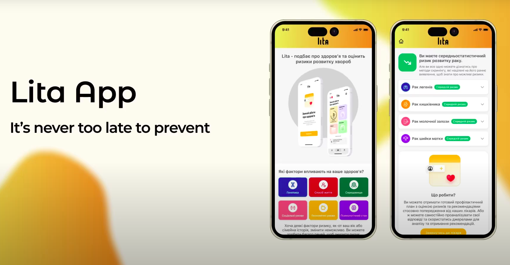
Lita-doctor is a family doctor and oncologist dashboard that allows patient prevention management (for now only according to WHO oncology test schemes, but others will be implemented in the future). This system is a continuation of the application and the third product of TOV Lita Health. The start of this software was given at the Harvard hackathon in April 2024.
Оглавление
How we built a medical MVP in 3 days at the Harvard hackathon
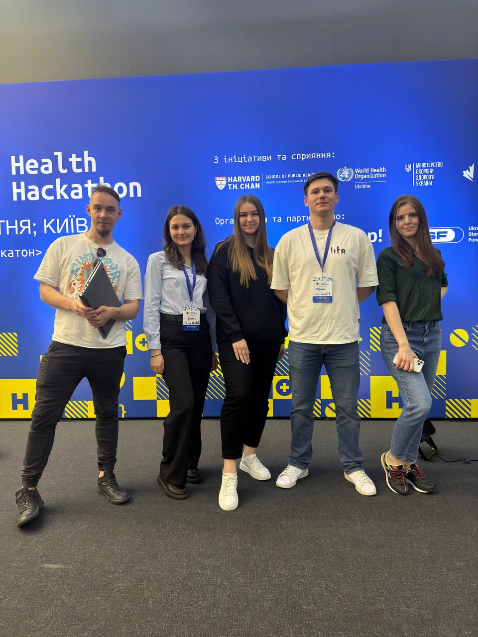
This was not just a hackathon with a little sleep deprivation =). It was Harvard Health Systems Innovation Lab Hackathon 2024 — an international healthtech event where teams had to come up with, design, build, and defend a new product for medicine in a matter of days.
Our team went into the oncology track and in 3 days built not just a beautiful idea, but a working vertical slice of the product (that is, not a mockup for the sake of a mockup, but a live piece of the system from interface to logic and data). We managed to go through product work, analytics, medical domain expertise, UX/UI design, frontend, backend, database, infrastructure, and package the project into a presentation and an English pitch. For a hackathon, this is no longer a sprint, but a small surgical operation on chaos =).
The hackathon itself was truly large-scale. Globally, it took place as part of the Harvard HSIL initiative, while the Ukrainian hub operated in Kyiv together with the international program. The room had doctors, founders, developers, researchers, mentors, representatives of the health environment, and people who know how to ask very unpleasant but very useful questions. And that is wonderful: this is exactly how good ideas stop being cute fantasies and start to resemble a product.
Speakers from different countries appeared on stage, live connections with other cities and hubs were running in parallel, and teams ran between mentors, hypotheses, laptops, and the coffee machine as if it were a distributed system (distributed system — when many parts must work together synchronously and not fall apart).
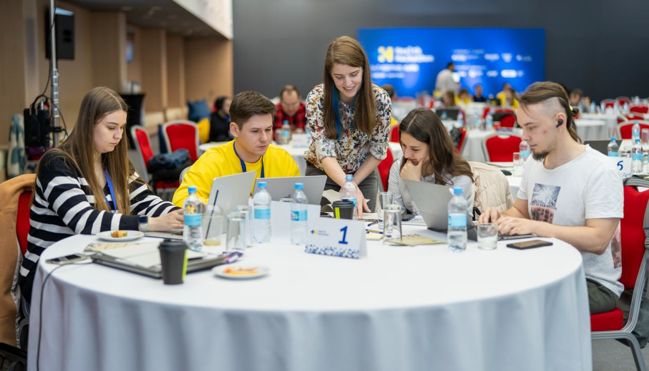
From the outside, everything looked like an impressive pitch. Inside, it was very grown-up work: in the morning you discuss medical logic, in the afternoon you design entities and roles, in the evening you fix the data flow, and at night you rewrite slides as if your lifelong dream had been to become an architect, analyst, and stand-up comedian all at once.
Over three days we were making new software, assembling presentations, practicing the English pitch, and going to mentors for criticism. They pointed out where the business model was fragile, where the UX was too academic, where the scenario for the doctor needed to be simplified, and where, on the contrary, the system needed to be made stricter. In the end, we got exactly what good hackathons exist for: not a set of screens, but a product that looks like the beginning of a serious medical platform.
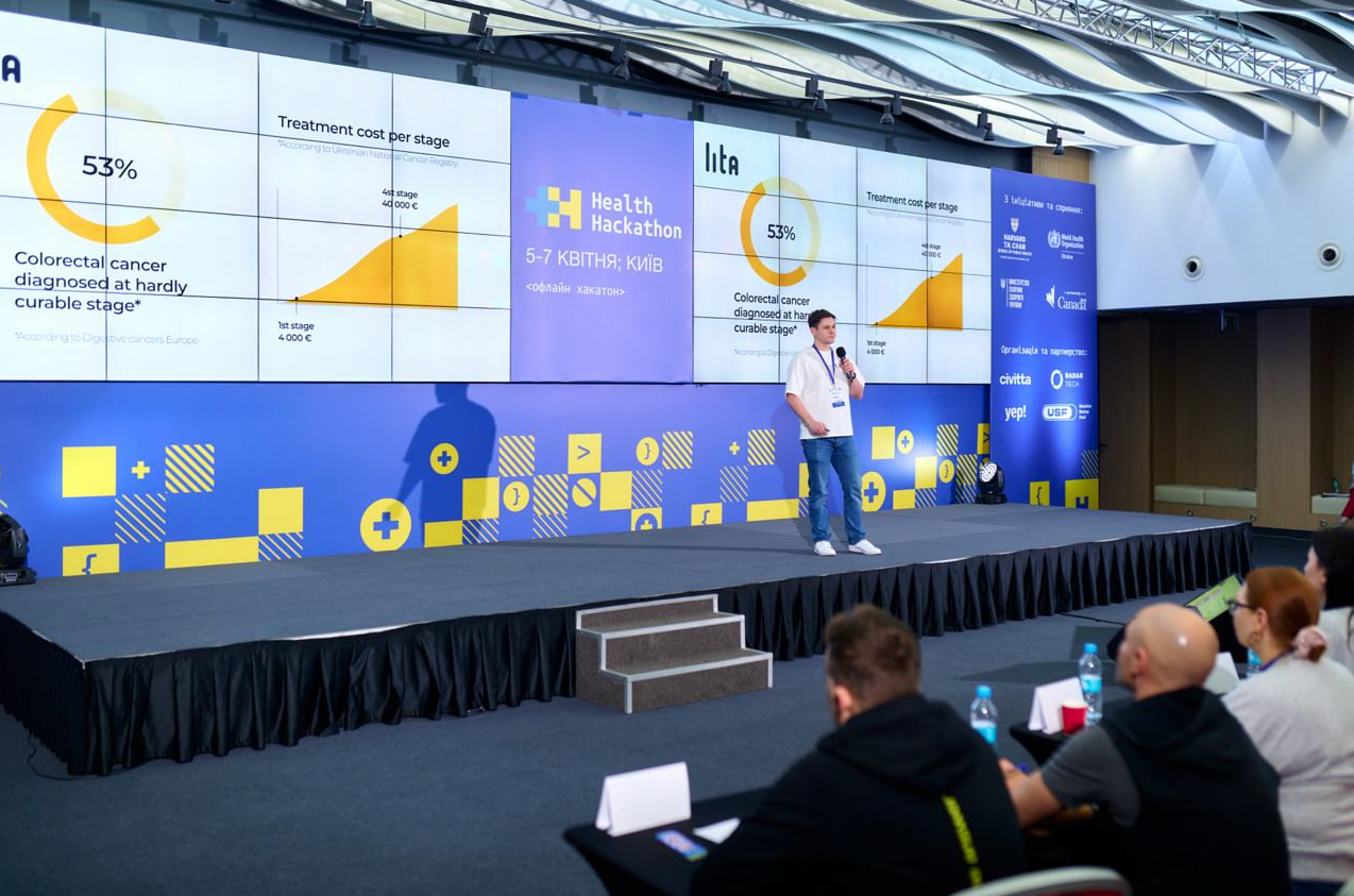
From the judges' reaction it was clear that our project was perceived not as a raw idea for investment, but as a solution that already has product logic, a clear usage scenario, and an architectural skeleton. And that is fair: when you have domain expertise, normal analytics, and strong engineering assembly, even an MVP starts to look as if it already has traction.
By the way, if the approach of not let's-quickly-code-it, but first-let's-figure-it-out-and-build-a-normal-system is close to you, take a look at how we approach design, work stages, and product architecture. It is exactly about that part of development that is usually not visible on slides, but it is what later saves the budget, timelines, and nervous system.
Below are several videos from the hackathon and the live atmosphere of the event.
What exactly we did
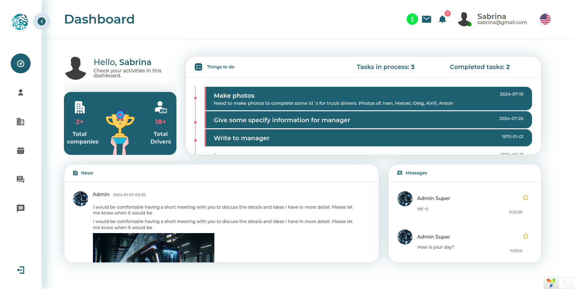
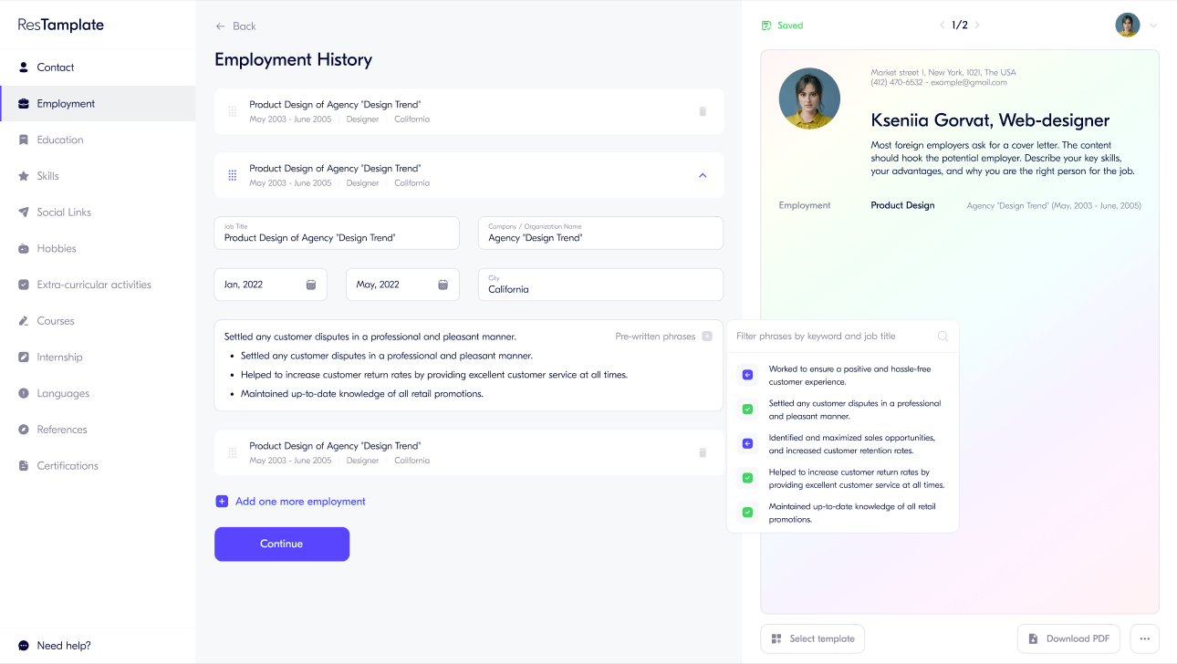
As part of the hackathon, we built the interface and logic of the doctor dashboard, which is integrated with the patient application. In short, this is a healthtech system for preventive oncology, where the doctor sees the patient, their tests, results, risk factors, and recommendations, while access to the data is managed by the patient themselves.
That is, what we had in front of us was not an abstract CRM with white cards and blue buttons, but a medical dashboard with very sensitive logic: the doctor's role, the patient's role, access rights separation, storage and display of tests, interpretation of answers according to medical algorithms, and secure data transfer between the parties. In architectural terms, this is no longer a landing page and not an online store personal account. It is a small clinical information system.
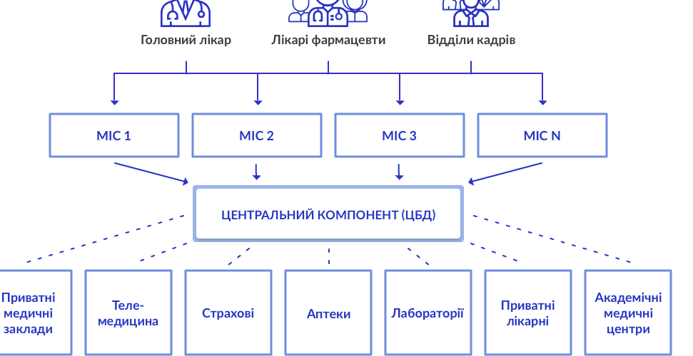
If you are interested in the broader topic of designing medical systems and integration with the state medical ecosystem, we have a separate case about designing an MIS for eHealth. It clearly shows how quickly medicine turns development from just code into an engineering discipline with a bunch of restrictions, standards, and nuances.
How the doctor dashboard works
At their workplace, the doctor sees a list of patients — but only those who themselves granted access through the application. This is an important point: we immediately built the system not according to the principle that the doctor sees everything because they are a doctor, but according to the principle of consent-based access (access by patient permission). For medicine, this is not a decorative feature, but a foundation of trust and legal accuracy.
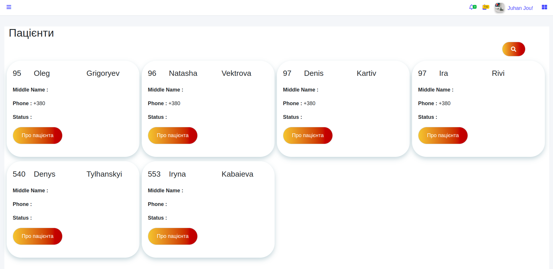
We deliberately made large typography, generous spacing, and visually clean cards. Because in real life, a doctor should think about the patient, not solve a puzzle of tiny numbers, ten tables, and thirty buttons on one screen. A good medical interface should not shout, but help.
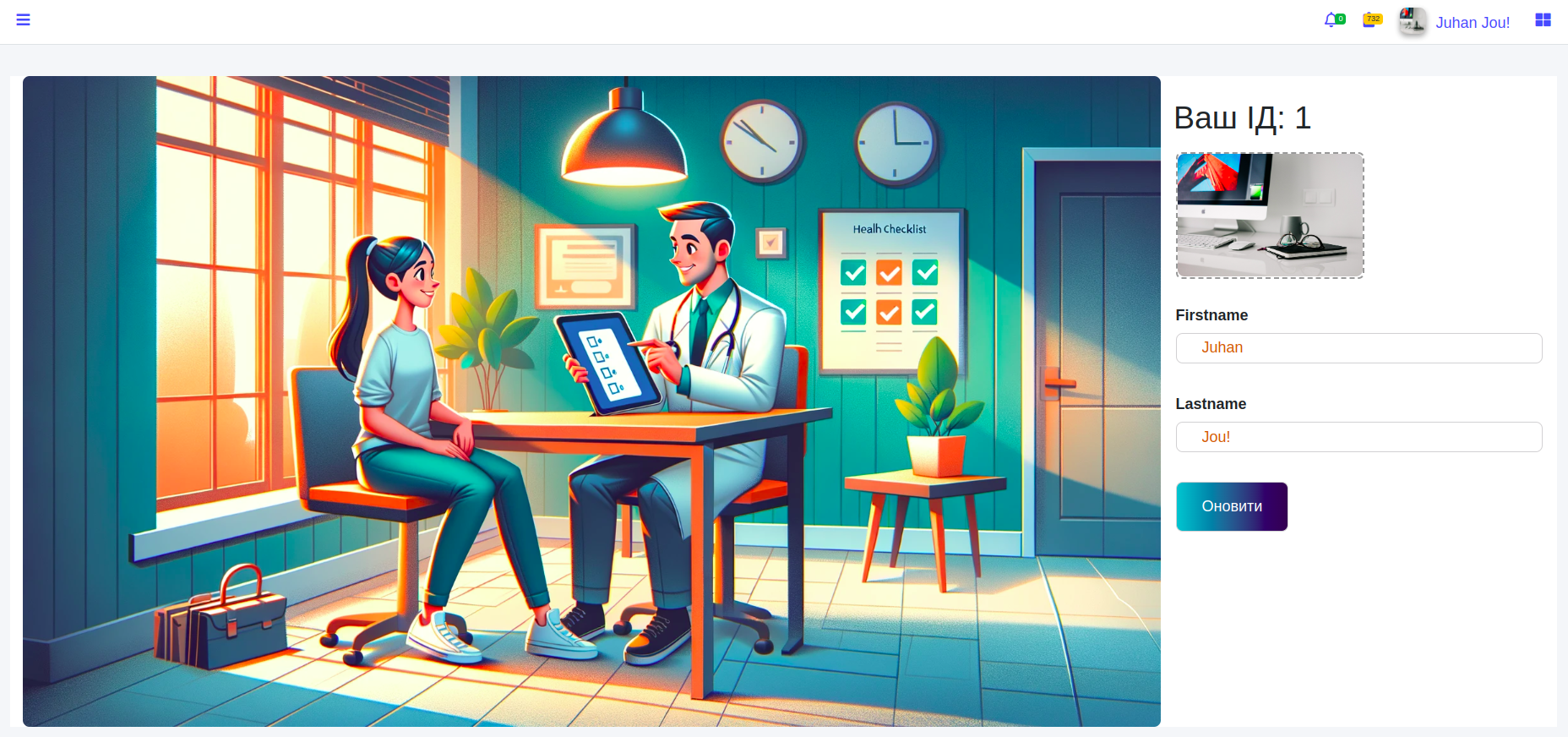
A unique identifier is generated in the doctor's profile. It can be given to the patient for connection within the system. The doctor can also upload a photo and update their data. This is a simple but important part of onboarding: the less friction at the entrance, the higher the chance that the tool will actually be used, rather than heroically ignored.
Next, the doctor opens a specific patient and gets access to their data and history of preventive tests. And this is where the most interesting part begins. Usually, when changing a doctor or clinic, the patient's history falls apart like poorly glued ceramics: pieces of data remain in different places, something gets lost, something is unavailable, something is on paper, something is in the administrator's head. We built the system the other way around — so that the examination history does not disappear together with a change of office, clinic, or person in a white coat.
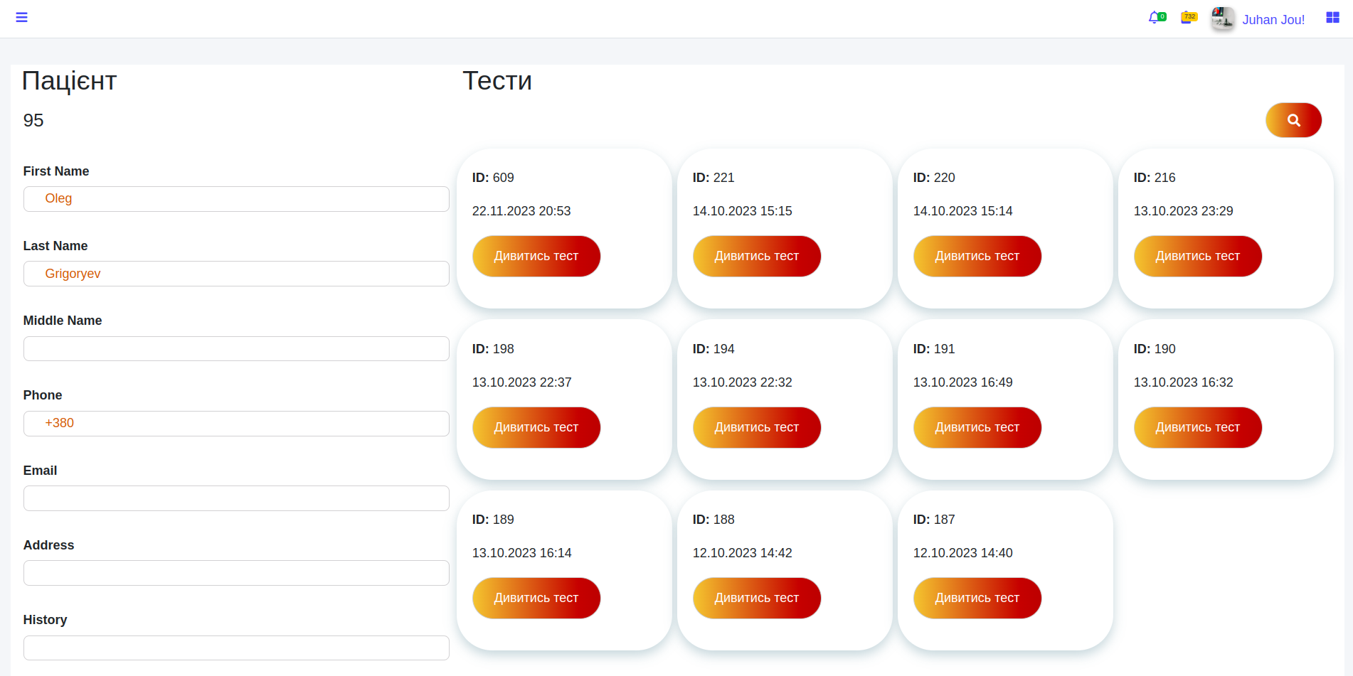
The doctor can view all tests to which the patient has granted access, including historical data. This is especially valuable in prevention and oncology: past context is often no less important than the current condition. Search by dates, parameters, and test types here is no longer convenience for the sake of convenience, but a clinical navigation tool.
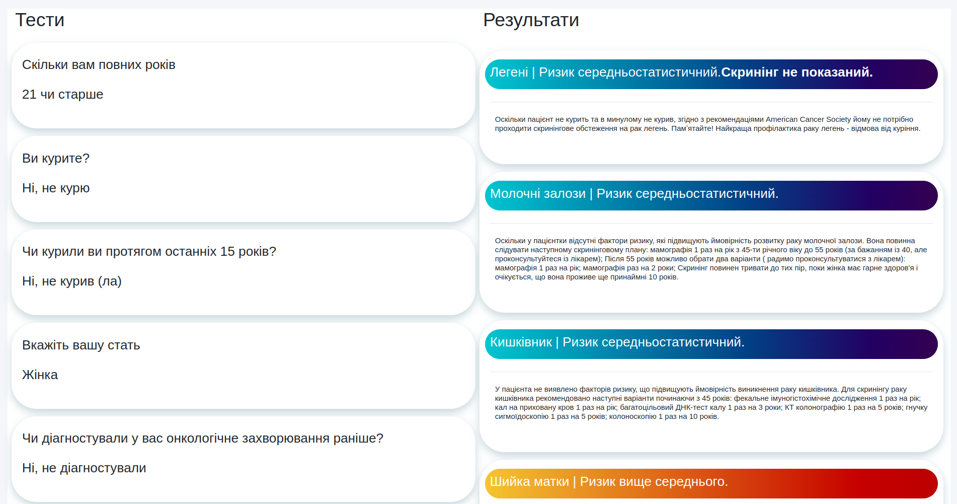
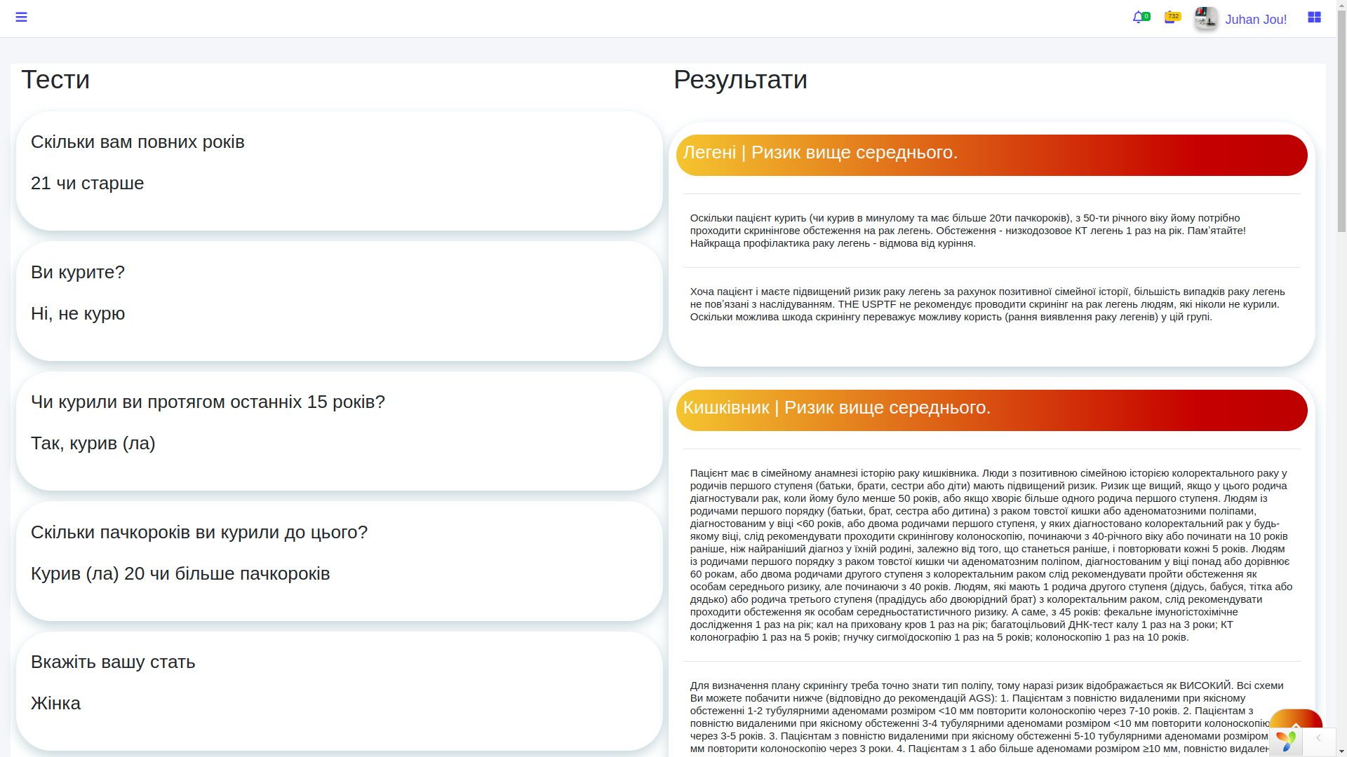
For each test, the doctor sees the patient's questions and answers on the left. The tests themselves are built on the basis of medical algorithms and logical branches — essentially this is a rule engine (a rules engine that selects the next question and final conclusions based on a set of conditions). Such schemes easily look simple from the outside and surprisingly treacherous inside: one answer changes not only the current screen, but the entire logic of the user's next route.
This mechanic is described in more detail in a separate case about the Lita application and oncology test builder, because the testing engine itself is an independent product with its own logic, scenarios, and medical validity. In this case, we focus specifically on the doctor dashboard and the doctor ↔ patient ↔ results connection.
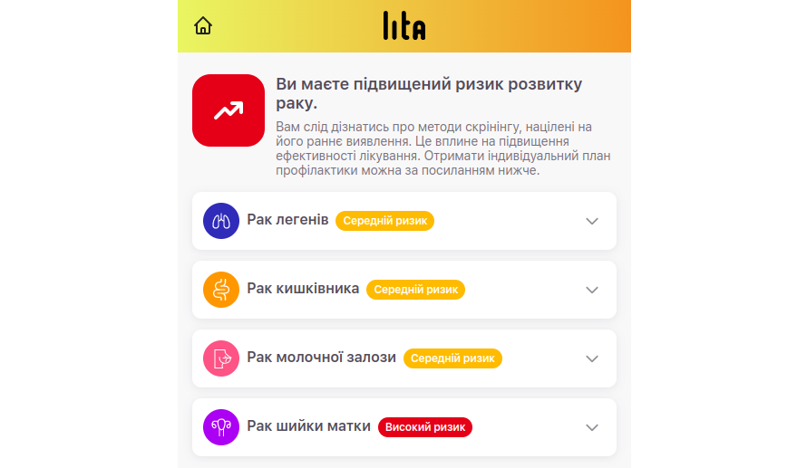
In the right column, the system shows results and recommendations formed on the basis of answers and those same medical algorithms. This is not magic and not generative shamanism, but reproducible logic: identical input data should lead to the same basic conclusion. Yes, the doctor can adjust the interpretation taking into account extra-systemic factors, but the system itself covers the routine part of the analysis and forms structured text by risk factors, priorities, and preventive steps.
For the doctor, this is useful in two dimensions at once. First, routine prevention decisions are accelerated. Second, structured material appears for mandatory reporting on performed preventive measures. That is, the system supports both clinical work and the administrative contour at the same time — and in medicine, that is a rare luxury.
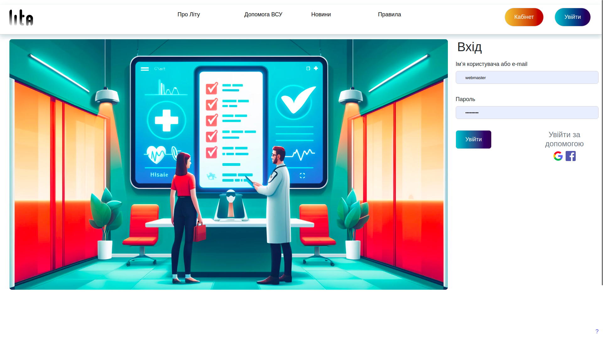
Login without unnecessary pain
You can enter the doctor dashboard in the classic way through a login and password, or through Google or Facebook. This is already a standard OAuth login (a mechanism where part of identity verification is handled by an external provider), which reduces friction during authorization and reduces the number of abandoned logins.
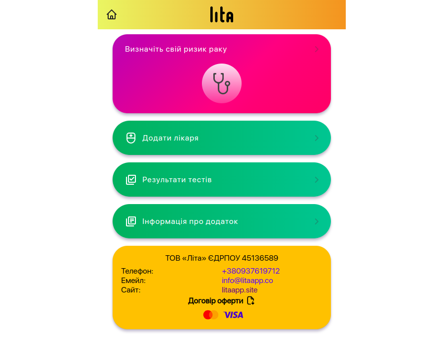
How the patient adds a doctor
The link between the patient app and the doctor's account is implemented through the Add Doctor section. The patient enters the doctor's identifier and independently decides exactly whom to grant access to. This is the case where UX directly serves privacy-by-design (an approach in which privacy is built into the product from the very beginning, rather than taped on later).
After confirmation, the doctor sees the patient's test history in their account. No magic, no default access, no medical telepathic field. Only an explicit patient action and a transparent rights transfer model. For sensitive medical data, this is, to put it mildly, the right path.
How the patient sees their results
From the patient's side, everything is also extremely clear. They can view the test results, study the recommendations and, if necessary, contact their family doctor. We provide materials for independent review, although, of course, we do not encourage people to play at being a home medical council without specialized education.
The user can also receive a full prevention plan, which is generated by the system and additionally checked by a real doctor. This is an important product idea: not to replace the doctor with a button, but to remove routine, structure data and help both sides get to a useful action faster.
What this case shows
This case clearly shows what real rapid development in healthtech looks like. Not the kind where three screens are drawn overnight and called innovation, but the kind where a working product connection is assembled in a very short time: the patient role, the doctor role, access rights, test algorithms, results, recommendations, authorization and a clear interface.
That is exactly why the judges reacted to our pitch as something too mature for an ordinary hackathon. When a team knows how to combine domain expertise, system analysis and software architecture (software architecture — that is, a pre-thought-out structure of the system, not a chaotic set of screens and tables), the result starts to look like a business, not like student amateur activity.
And if you already have an idea for a medical product, doctor's office, patient app, MIS, B2B platform for clinics or a complex healthtech service, take a look at our approach to designing and launching such systems. There is information about the company, working principles, stages, reviews and the opportunity to submit a request for a free consultation. No magic, but with analytics, architecture and grown-up questions at the start =).